
Safeway
Co-led a human-centered redesign of Safeway’s self-checkout kiosk, using heuristic evaluations and user testing to simplify navigation, enhance discount clarity, and improve overall user satisfaction.


Clifornia,USA
1915
Retail
$80.4 billion (2024)
325,000+

Challenge
Safeway self-checkout kiosks allow customers to scan, bag, and pay for their groceries without assistance from a cashier. While these kiosks aim to streamline the checkout process, users often face challenges such as scanning errors, unclear payment steps, and usability issues that lead to frustration and delays. The goal of this redesign was to enhance the self-checkout experience by addressing these pain points, improving efficiency, and making the interface more intuitive for users of all backgrounds. The following are the three main problems that we aimed to solve
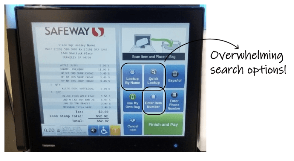
Confusing and Redundant Search Experience
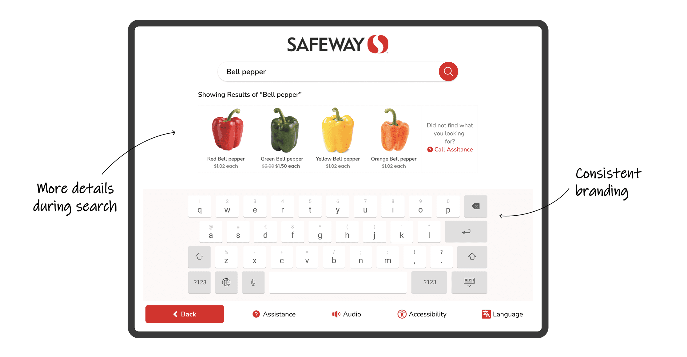
The search functionality requires users to remember exact product names—for example, searching “russet” does not yield results for “Potato Russet.” This rigid requirement can lead to frustration.
Additionally, having three different search options on the home screen creates visual clutter and makes it unclear which one to use, overwhelming users right from the start.
Lack of Clear Feedback on Discounts
To apply discounts, users must either scan barcode tags from the store aisles or manually add them through the app before checkout—this process is not intuitive.
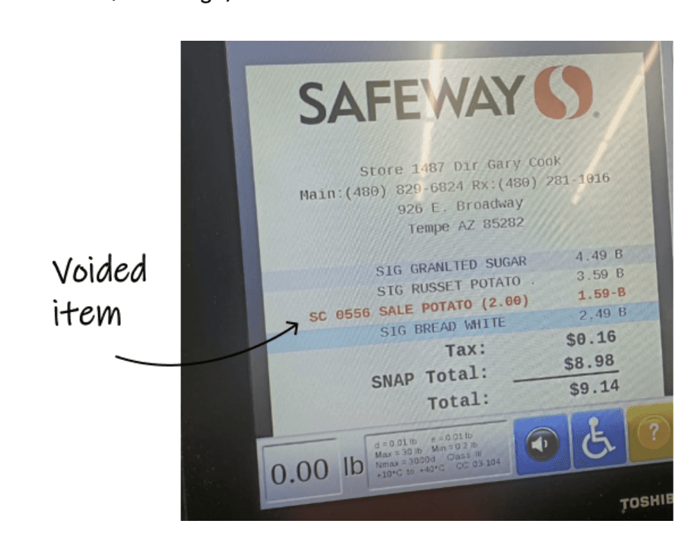
Discounted items are hard to discover, and there's no clear indication if a discount has been successfully applied unless checked in the app.
On the final bill, discounted and voided items appear visually similar, making it confusing to confirm whether a discount was actually applied (see image for reference).Inconsistent Visual Design and Branding
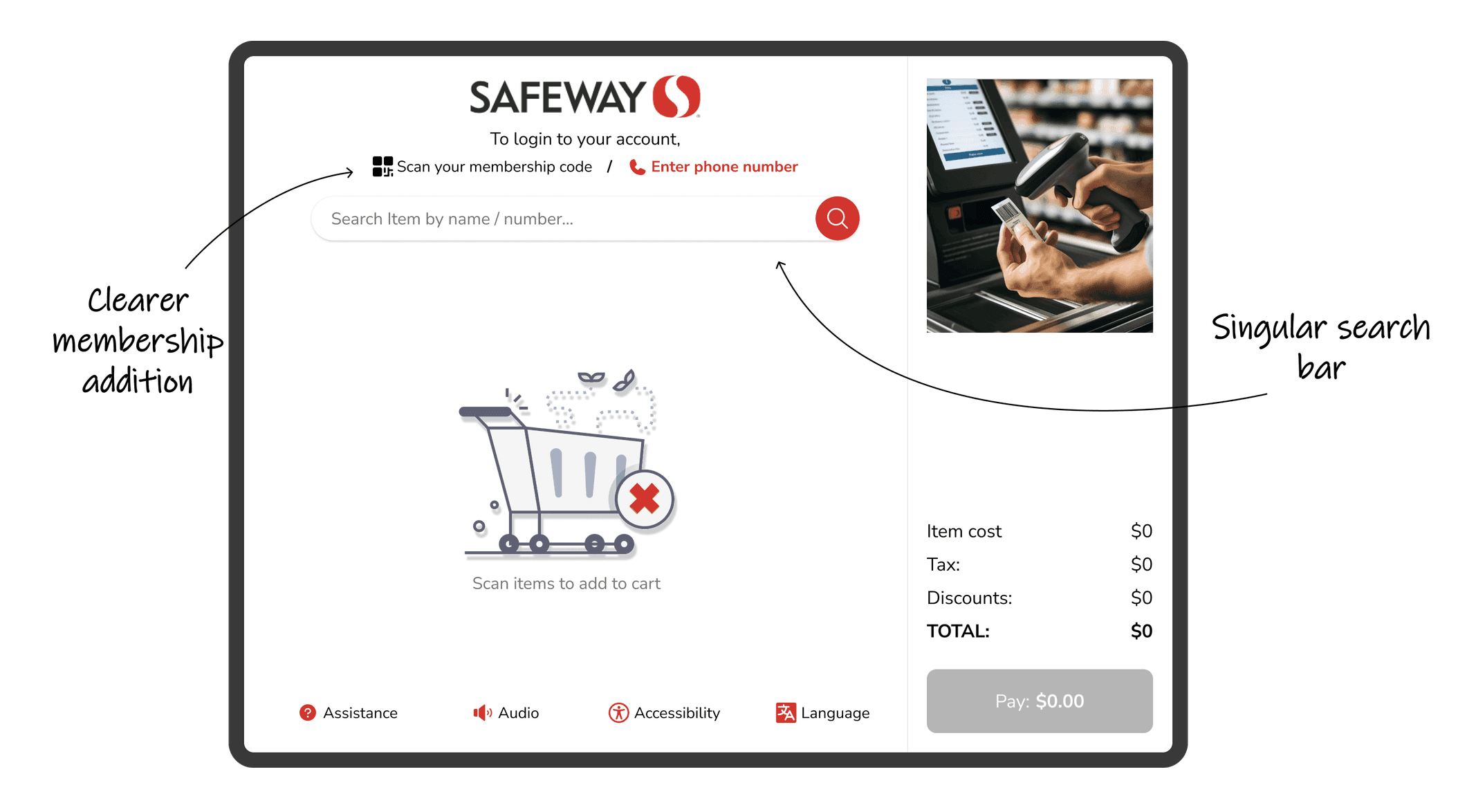
The checkout journey lacks a unified look and feel—each screen varies in layout, creating a disjointed and inconsistent experience. This lack of visual harmony makes the process feel fragmented and harder to follow.
Additionally, the interface does not reflect Safeway’s core brand elements, such as its signature red color. This weakens brand recognition at the kiosk and may leave users unsure if they’re still interacting with a Safeway system.
35%
Improved checkout process
25%
Increase in user retention
84%
Increase in time spent on website
Solutions and Wireframes

Research Methods Applied
Heuristic Evaluation
We analysed the usability of Safeway’s self-checkout kiosk using Jakob Nielsen’s 10 usability heuristics. Each issue was rated on a severity scale from 0 to 4, helping us identify key pain points. The examples shared above highlight some of the major usability concerns uncovered during this assessment.
Cognitive Task Analysis
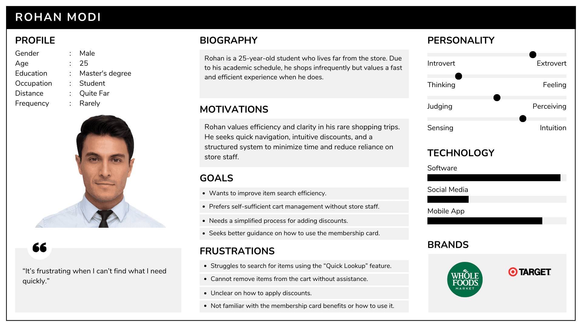
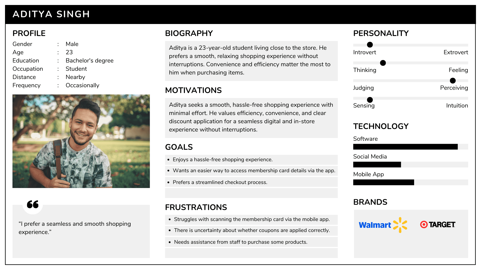
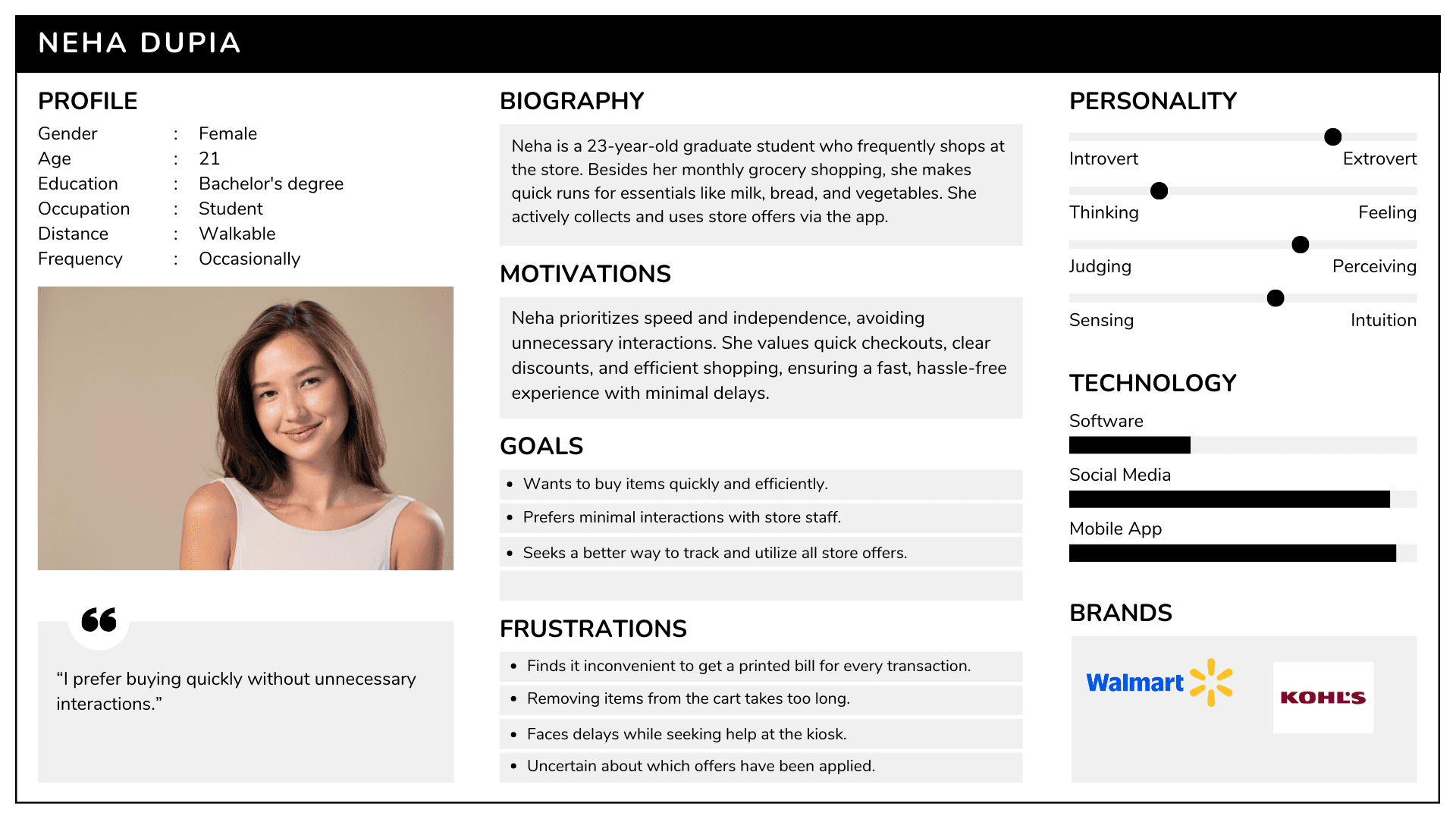
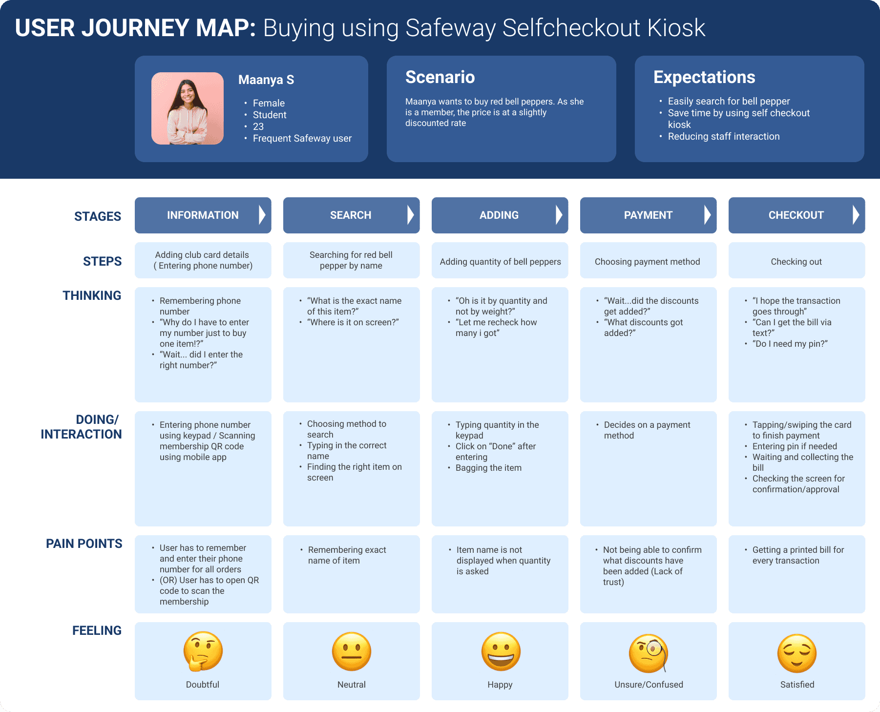
To understand the user journey, we asked participants to complete a simple task: “Add your club card details and purchase a red bell pepper.”
At each step, we observed:
Tools and materials required
User decision points
Available perceptual cues
Prior knowledge expected
Situational awareness demands
User Persona's
User Journey Map
Success of Redesign
Usability testing was conducted on all three types of users and the time efficiency increased by 60%. The environmental conditions were not very similar to Safeway checkout areas, but users understood the new UI, flow, and interactions much better, reducing the confusion.


“ With our new visual branding and language in place, the new Safeway brand clearly captures the essence of Safeways's current and target customer base, our employees, and our values. ”
Heather Lum I Methods & Tools Human System Engineering
Professor, Arizona State University


Conclusion
The Safeway Kiosk redesign successfully addressed the usability issues, resulting in a more intuitive and user-friendly experience. The improved UX/UI design led to increased user adoption, engagement, and satisfaction, demonstrating the value of a well-designed template for UX designers.