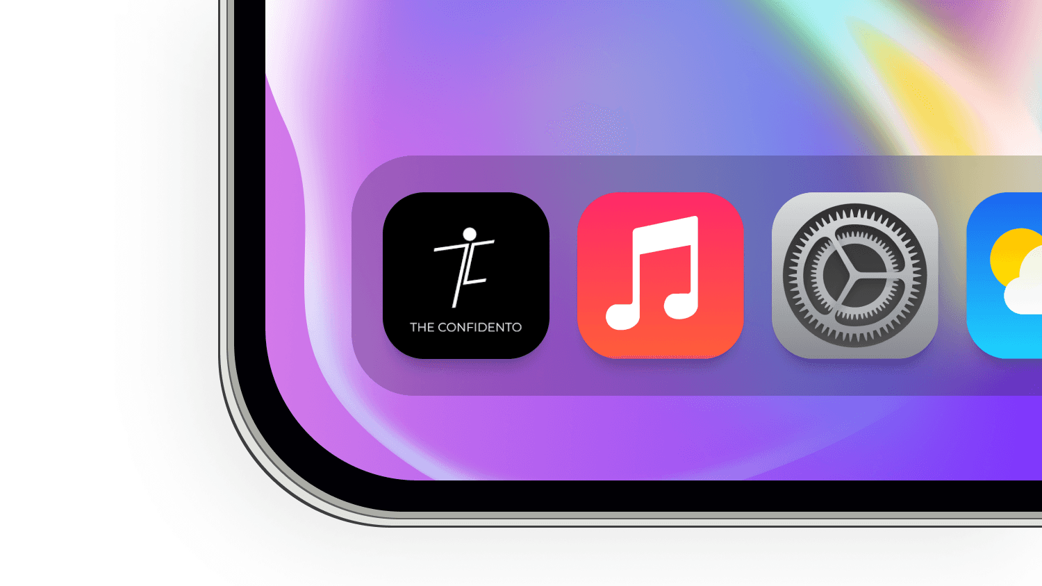
TheConfidento
Empowering Confidence Through Communication

Concept
Design System
Role
UX Design
Educational Technology
6 weeks
Goal
Improve customer onboarding by making it more structured, intuitive, and scalable. We aimed to reduce friction, increase visibility into progress, and deliver a unified experience across multiple customer journeys.
Key Responsibilities:
UX Research
Wireframing & UI Design
Visual System Creation
Prototype & Interaction Design
Design for Dark Mode
25%
User Retention
84%
Increase in average time spent
35%
Improvement in task completion

Problem Statement
Many people struggle to express themselves confidently despite having valuable thoughts and ideas. TheConfidento seeks to solve this by helping users build public speaking abilities and social confidence through structured learning, practice tracking, and motivation tools.
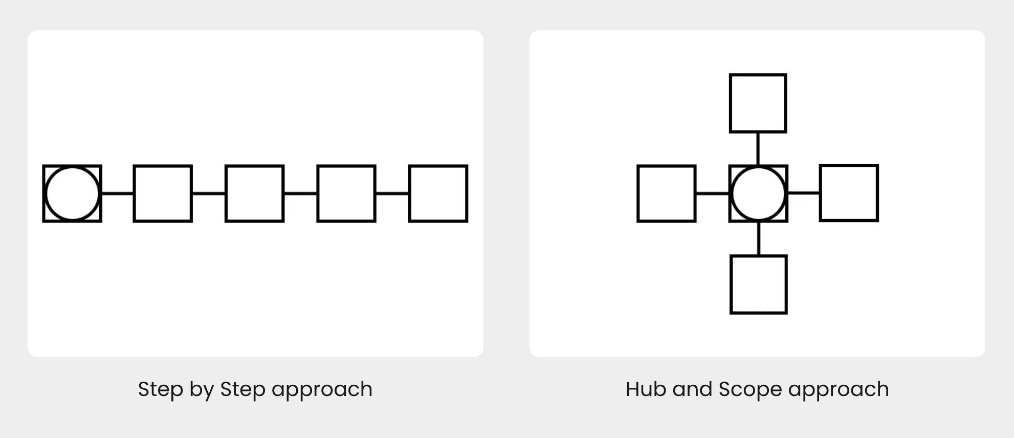
User Research
Conducted usability testing to compare Step-by-Step and Hub-and-Spoke navigation models, measuring comprehension, task completion time, and flexibility.
Designed and iterated on multiple Hub-and-Spoke variations to map task flows, establish layout patterns, and identify the most intuitive user journey.
Complemented this with audits of existing flows and collaborated with cross-functional teams to align on technical constraints and cross-product requirements.
The Process
Implemented a Hub-and-Spoke model for returning users, providing a centralized view of onboarding progress and personalised entry points into different tasks.
Key features included:
Modular, tile-based task cards with live status (Start, Review, Complete)
Scroll-free document upload UI with timestamped files
Dynamic progress indicators and smart banners
Built using Pacific Design System components for scalability and consistency
Design Goals
Building and scaling Confidento's first design system and design bite-sized, gamified learning modules
Enable daily learning tracking and streaks
Establishing Confidento’s first centralised design system and launching its official documentation platform.
Offer expert-led content in a course format
Provide flexible light & dark mode experiences

Key Features Designed
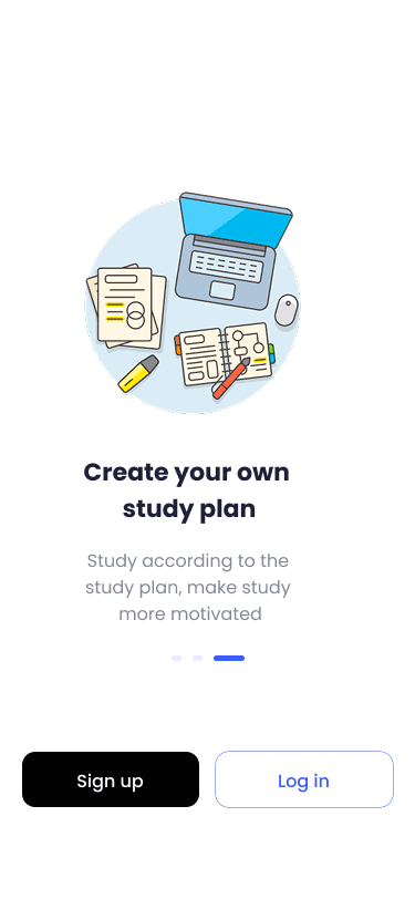
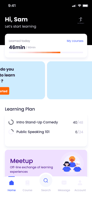
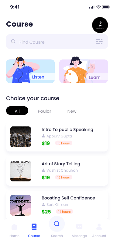
1. Personalized Dashboard (Home Screen)
Highlights daily progress, learning goals, and course recommendations with cheerful illustrations and a modular layout.
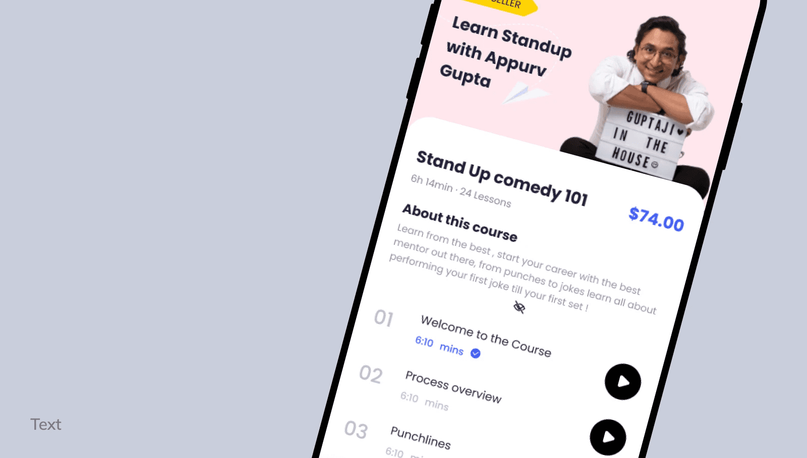
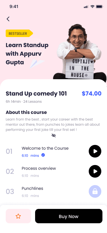
2. Learning Plan & Course Detail
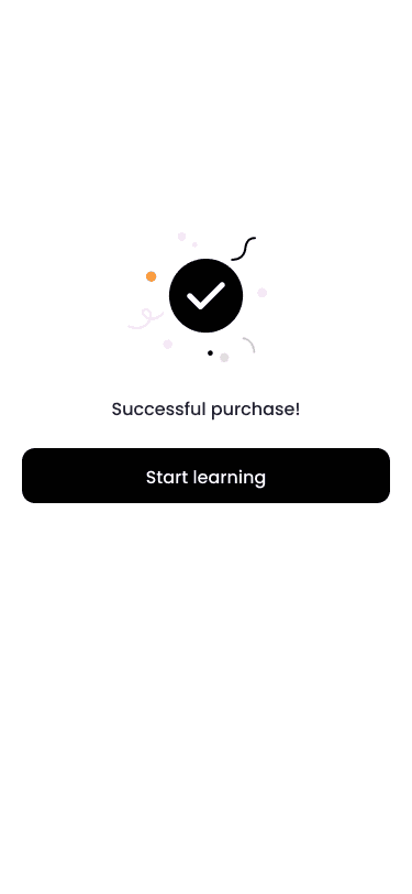
Courses are broken into short, trackable segments. Users can see mentors, pricing, lesson structure, and purchase options in a clean, scannable interface.
3. Clock-In Motivation Pop-Up
After each session, a motivational summary encourages consistency. It includes a weekly visual tracker and share option to promote engagement.
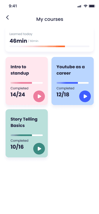
4. My Courses + Progress Bars
Segmented by completed lessons, the interface gives a clear sense of growth. Color-coded tiles indicate course themes and progress.
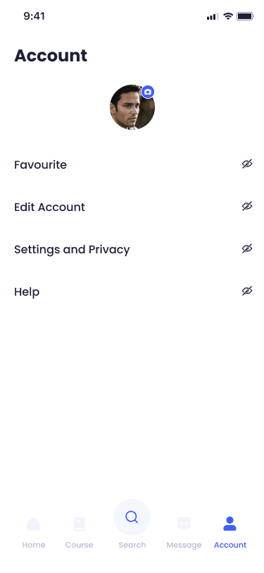
5. Profile & Settings
Minimalist design allowing personalization and privacy control. Designed for clarity with visual hierarchy and icon affordance.
6. Course Playback View
Intuitive media player integrated with content preview. Seamless transitions between watching and navigating other parts of the app.
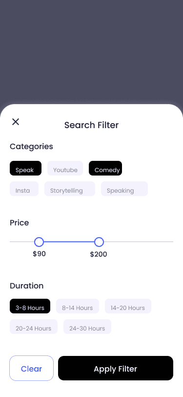
7. Search & Filter Interface
Optimized for user intent with tag-based filtering, fuzzy search, and course previews with pricing and duration.


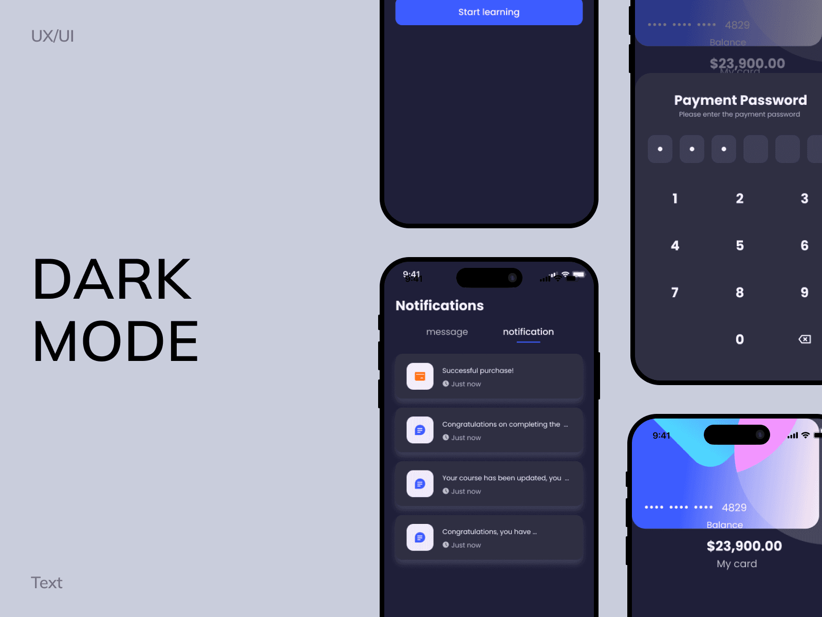
Dark Mode Consideration
Understanding that learning often occurs in dim lighting (especially late at night), I designed a dark mode using:
Contrast ratios > 4.5:1 for readability
Soft, desaturated backgrounds to reduce eye strain
Highlight colors (blues, purples) retained across both modes for brand consistency

Design System
Typography: Rounded, accessible sans-serif for a friendly tone
Colors: Youthful and optimistic with high contrast
Components: Reusable UI kit built in Figma with auto layout
Outcome & Next Steps
Usability testing with first batch of learners is planned via Maze
Explore AI-powered speech feedback for future phases
Potential for community-based peer review in upcoming versions

Reflection
This was a quick glimpse of what I did while leading design for this project, reach out to know more about scaling the feature, use cases, testing insights :)