All projects
Design Systems Product Design Wellness Component Library

Nature Counter

Building a unified design language for a growing wellness platform — enabling a small team to ship consistent, accessible experiences at scale.

Role Lead Product Designer
Timeline 2024 — Present
Platform iOS, Android, Web
Users 100,000+
Nature Counter MVP OT showreel overview

Outcomes

30% fewer inconsistencies · 45% faster handoff · 100K+ users on a unified system

30% reduction in UI inconsistencies across all platforms
45% faster design-to-dev handoff after system launch
100K+ users on the platform benefiting from consistent UX
100% WCAG AA compliance on all new components
01
Overview

Building the design foundation for an app that reconnects people with nature

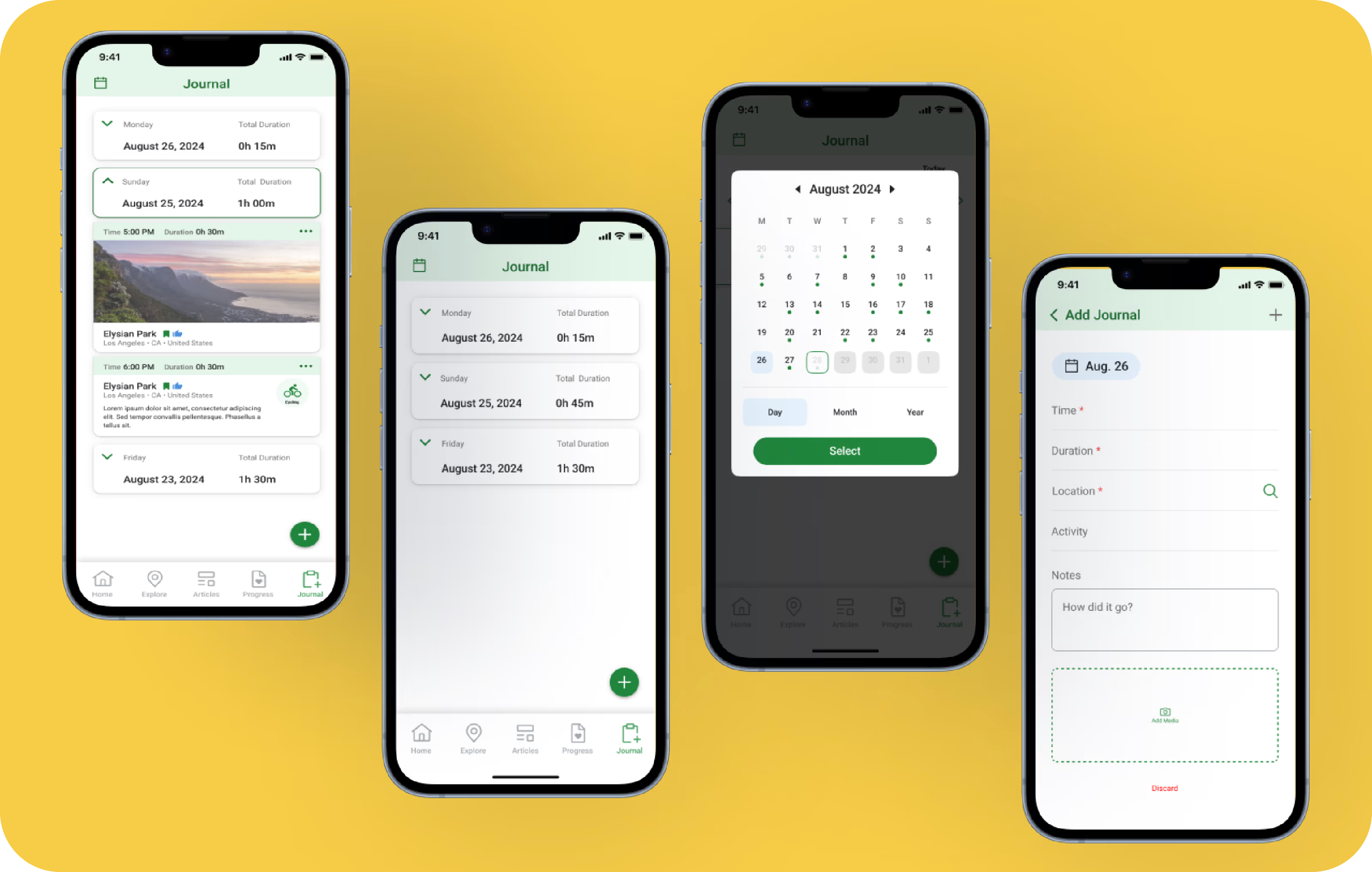
NatureCounter is an early-stage wellbeing app encouraging users to spend mindful time outdoors by logging, sharing, and setting goals around their nature exposure. When I joined, the app had core functionality in place — but lacked UX consistency, scalable design components, and a visual language to guide future growth.

I built the design system from the ground up: defining the foundations, creating a reusable Figma component library, and producing documentation that made adoption seamless for engineers. The goal was to empower the team to build new features faster without sacrificing quality or consistency.

Industry

Health, Wellness & Fitness

Timeline

2024 — Present

Platform

iOS

Components Built

40+ production-ready

Skills

Design Systems · Tokens · Figma Variables · Accessibility · Documentation

HQ

California, USA · Founded 2020

02
Problem

Core functionality was there — but no visual language, no consistency, no foundation to build from

NatureCounter had core journaling functionality when I joined, but the app had grown without a shared design foundation. Components were built in isolation, styling was applied inconsistently across screens, and there was no token layer to anchor decisions. Every new feature meant starting from scratch.

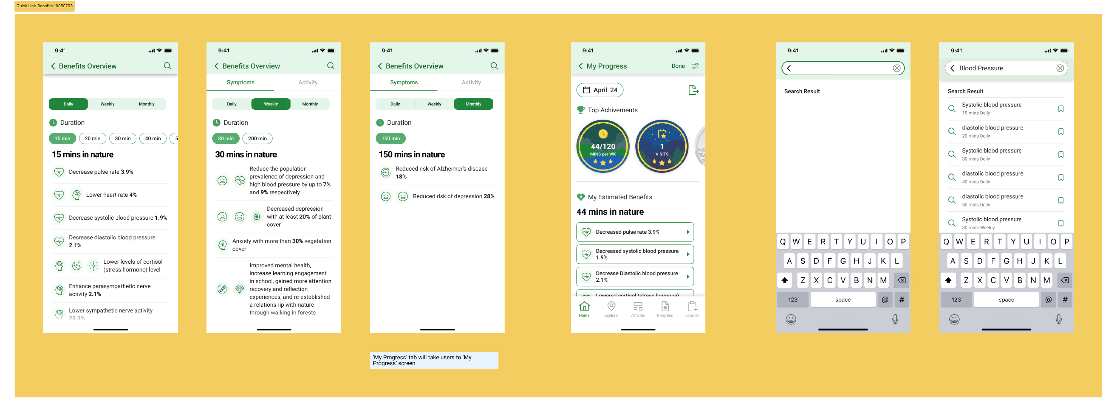
The first-time user experience in particular was fragmented — onboarding and goal-setting flows lacked the visual clarity needed to convert curious newcomers into committed nature journalers. The team needed a system that could scale with the product, not just patch it.

  • No shared component library — UI elements rebuilt screen by screen
  • No token layer — styling decisions made ad hoc with no single source of truth
  • Inconsistent interaction patterns across journaling, goal, and home flows
  • FTUE (first-time user experience) had no clear design language to guide new users
  • Design–dev handoff relied on verbal explanations, not documented specs

"Every new screen felt like a negotiation — what should a button look like here? What's the right spacing? A design system answers those questions before they're even asked."

03
Process

Foundation first, then components, then documentation

Design systems fail when they're built in isolation. I started with a collaborative foundation sprint — working with engineers and the PM to ensure the system would actually get used, not just specced and shelved.

01
Design System Foundation
Defined the visual hierarchy for typography, iconography, and spacing across the app. Introduced atomic principles — buttons, form elements, feedback states — and established consistent layouts from home dashboards to journal entries with clear call-to-action flows.
02
Scalable Components
Built reusable Figma components for modals, buttons, pickers (time/date), cards, inputs, and navigation. Designed for flexibility and edge cases — e.g., AM/PM toggles, error handling for required fields, disabled states like the "Save Journal" button.
03
Interaction Guidelines
Standardised interaction patterns for journaling workflows and goal tracking. Created documentation for micro-interactions: start timers, select times, edit goals. Set behavioral rules for button states, transition animations for journal submissions, and onboarding flow.
04
Handoff & Visual QA
Led Figma-to-dev handoff via component naming conventions and usage guidelines. Ran VQA rounds on time pickers, journal cards, and calendar views. Collaborated with PM and engineers to handle edge cases — zero states, visual feedback for errors, and first-launch experience.
04
Solution

A living system — tokens, components, and documentation as one

The Nature Counter Design System launched with a token-first architecture. Every color, space, radius, and motion value is a named token that maps from primitive → semantic → component. This means theme changes (like dark mode) require updating one layer, not hundreds of individual values.

Nature Counter component library and token architecture
05
Results

Consistent, faster to ship, easier to onboard

After rollout, measurable improvements across every tracked dimension. The design system removed the guesswork from feature development — new screens could be assembled from existing components instead of rebuilt, and engineers had clear specs to work from on day one.

30%
Reduction in UI Inconsistencies
UI inconsistencies caught in QA dropped by 30% — component reuse replaced ad-hoc decisions with pre-validated patterns.
25%
Faster Feature Rollout
Feature development velocity improved by 25% — new screens were assembled from the library, not built from scratch each time.
84%
Onboarding Completion
First-time user experience redesign drove an 84% onboarding completion rate — clearer flows, better visual guidance, less drop-off at key moments.

"A robust design system not only enhanced app reliability — it made it easier to iterate, scale, and adapt the product with confidence."

06
Assets

Nature Counter visual asset showcase

All available files from the Nature Counter image folder are surfaced below for quick review and reference in one place.

Nature Counter hero composition — full design system overview

Design System Overview
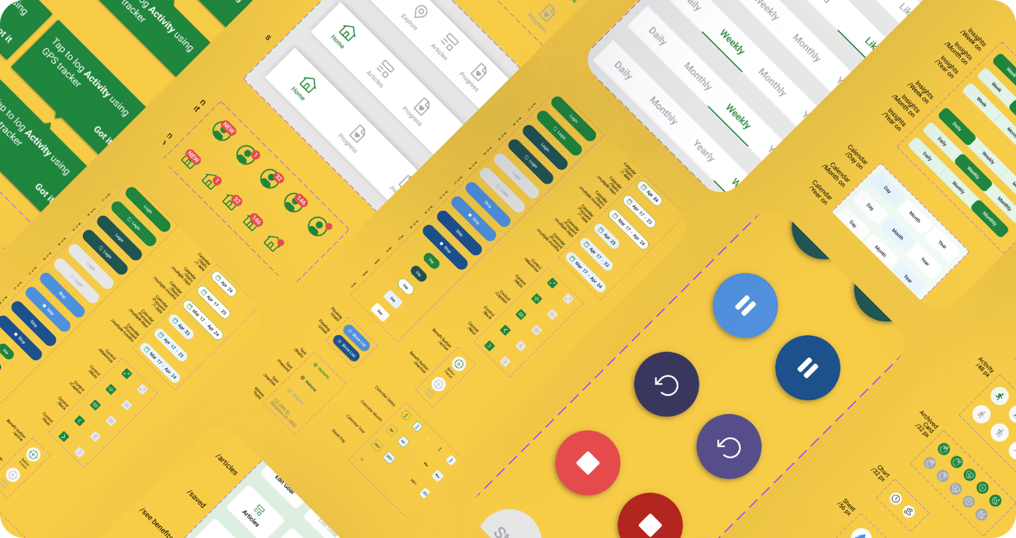
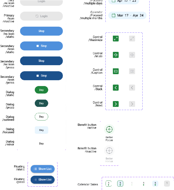
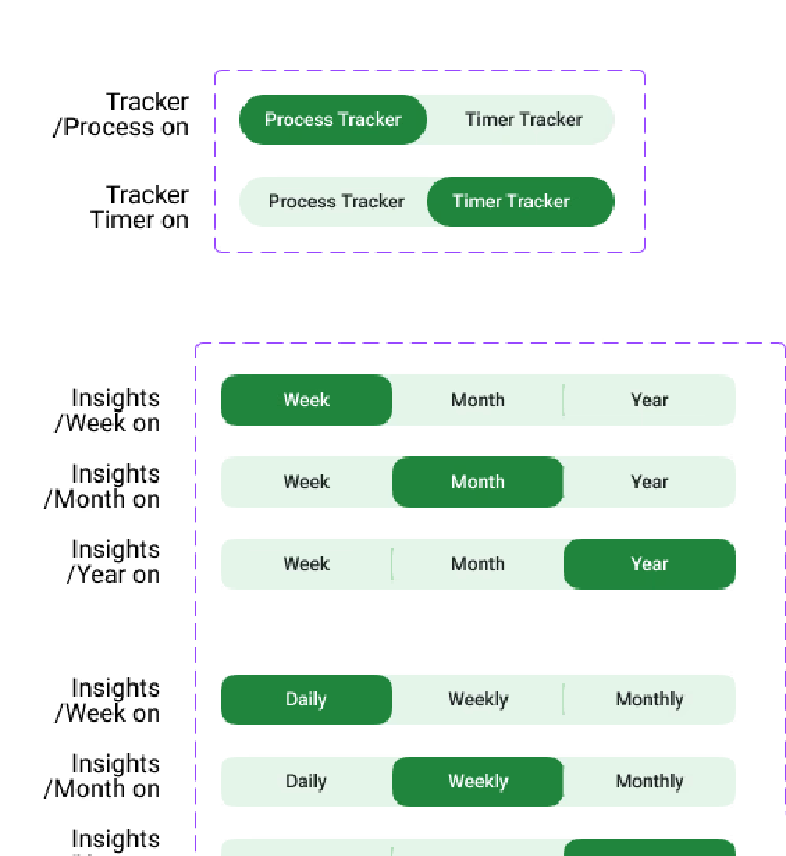
Nature Counter component library — primary UI components

Component Library

Nature Counter design tokens — color, type, and spacing system

Design Tokens

Nature Counter interaction patterns — states and transitions

Interaction Patterns
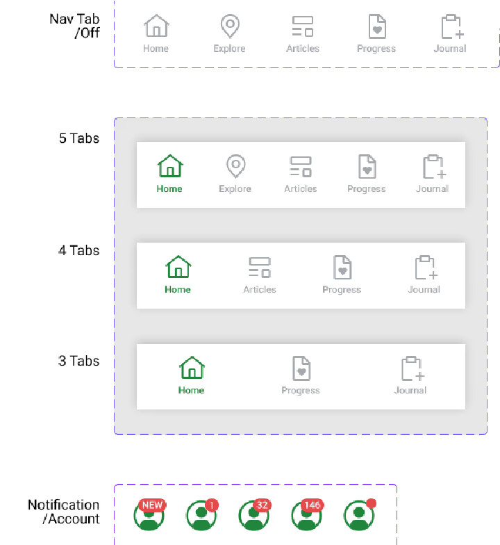
Nature Counter mobile component — compact layout variant

Mobile Component

Nature Counter design system detail — iconography grid

Iconography

Nature Counter design system detail — spacing and rhythm

Spacing & Rhythm

07
Constraints

No users to interview. So I designed for the conventions they already trusted.

Design system projects look deceptively calm from the outside — no user in crisis, no critical flow breaking. But the real constraint is invisible: you're building infrastructure that every future designer depends on, with limited access to end users early, and a delivery deadline that doesn't move. Get the foundations wrong and the team pays for it in every sprint after.

The triangle: I picked Time + Quality. Scope was where I said no.

Handoff deadlines were fixed. The system had to be production-quality — half-baked components would create more debt than they solved. So scope control was the lever. I drew a hard line: only what the 100K+ user base would touch in the next two quarters made it into V1.

01
Finding Assumptions Without User Access
Without early user interviews, I anchored assumptions to WCAG 2.1 accessibility standards, wellness app interaction conventions, and analytics from the existing product. I didn't need to ask users what they expected — I needed to design what they already knew. Familiarity in wellness apps is a feature, not a failure of imagination.
02
What Moved to V2
Motion and animation tokens, dark mode variants, and complex data visualisation components were explicitly deferred. V1 shipped with typography, colour, spacing, iconography, and the core interaction kit. Everything else was documented with clear V2 ownership so the next sprint had a head start, not a blank page.
03
How AI Accelerated Documentation
Design system work is 50% design and 50% documentation. Figma Make helped scaffold component variants I then refined, cutting the repetitive work. Claude Code helped generate usage guidelines and code snippets that matched the component logic — so engineers got working code, not just visual specs. The 45% faster handoff wasn't just good design. It was AI-assisted documentation.

"A design system isn't done when everything is built — it's done when everything unnecessary has been cut."

08
Reflection

Design systems are as much about documentation as design

01
Constraints create coherence
The best design systems aren't the most flexible — they're the most opinionated. Clear constraints on spacing, color usage, and type scales reduced decision fatigue for the whole team.
02
Documentation is the real deliverable
A component library without clear naming conventions and usage guidance is just a Figma file. The 45% handoff reduction came from documentation quality, not component count.
03
Systems thinking over visual craft
Design system work demands thinking about relationships between components, not just how individual elements look. The mental shift from "designing screens" to "designing systems" was the hardest part.
04
Build with engineers, not for them
Co-authoring the component API with engineers meant zero back-and-forth during implementation. What design names ButtonPrimary, code names ButtonPrimary — simple, but transformative.

Conclusion

Nature Counter taught me that design systems are the most leveraged design work you can do — every hour invested in the system pays back across every future feature, every future engineer, every future sprint.

The 100K users on the platform never see the design system. They just experience a product that always feels coherent. That invisibility is the whole point.

Glad we could cross paths.
Out of anywhere you could be, you're here.

Next project

Saarthi
All projects