All projects
Educational Technology Product Design iOS & Android 0→1

TheConfidento

In a world where communication happens faster than our thoughts, finding the confidence to express ourselves has quietly become one of the biggest modern challenges. TheConfidento exists to change that.

Role UX Researcher · UI Designer · Design System Architect
Industry Educational Technology
Timeline 6 weeks

Outcomes

54% satisfaction lift · 44% more time on app · 35% rating improvement — in 6 weeks

54% Increase in user satisfaction
44% Increase in average time spent
35% Improvement in user rating
71 survey respondents informing the research foundation
01
Overview

Starting with a thank you

I appreciate you taking the time to review this case study. I chose this example because it demonstrates my ability to create creative and elegant solutions to technical problems, my ability to design beyond the typical screen, and my ability to effectively collaborate with both internal and external partners.

The goal was to create a centralized system where users could learn, practice, track progress, and build confidence through small, repeatable actions. Instead of overwhelming learners with long modules, TheConfidento focuses on bite-sized progression, progress visibility, and autonomous exploration.

02
Roadmap

Two tracks across six weeks

The project was structured across two parallel tracks — UX Design and UI Design — with research, synthesis, and visual execution happening in sequence. Discovery ran through the first month; visual design and prototyping carried the second.

Project roadmap Gantt chart

UX & UI Design phases — week by week

03
Problem

People have valuable ideas — but struggle to voice them

Many people struggle to express themselves confidently despite having valuable thoughts and ideas. TheConfidento seeks to solve this by helping users build public speaking abilities and social confidence through structured learning, practice tracking, and motivation tools.

Existing tools often focus on "courses" but not motivation systems. They lack a clear learning structure, overwhelm users with long modules, and fail to communicate safety, privacy, or trust.

  • Focus on courses — but not motivation systems
  • Lack a clear, structured learning path
  • Overwhelm users with long, rigid modules
  • Fail to communicate safety, privacy, or trust
  • Lack personalized, self-paced journeys

Opportunity

A seamless, modular, progress-driven communication learning app that feels safe, enjoyable, and achievable.

04
Research

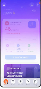
71 respondents revealed how people really feel about speaking up

To understand how people actually feel about speaking up, I ran a survey across students and working professionals. The goal: learn how confident they feel speaking in front of others, how often they avoid it, whether they're actively trying to improve, and what motivates them to keep practicing.

50% Are college-going students
58.8% Hold back from speaking even when they have something to say
73% Want to invest at least 1 hour to improve their communication skills
71 survey respondents across students and working professionals
User survey data — profession, speaking habits, motivation drivers, improvement activity

Survey insights across 71 respondents — profession, speaking habits, motivation drivers

Three user categories — one primary persona to guide design

After analysing the survey, we divided target users into 3 primary categories: Working Professionals, College Students, and School-going Students. For each category, we had conversations with multiple individuals and collectively built user personas.

Primary persona — Rohan Malhotra, College Student

No competitor combined progress, motivation, and good UX

We audited ELSA, Grammerly, Talk Life, Orator, and Presentation Coach across 7 key feature dimensions. The gap was clear: no single tool combined a progress tracker, reward system, dark mode, 24/7 support, tutor customization, and genuinely good UX.

Competitive analysis matrix across 5 apps and 7 feature dimensions

Feature comparison — 5 competitors × 7 dimensions

Anxious, hopeful — and not sure where to start

To move forward in the ideation phase, I created an empathy map of what our user says, thinks, does, and feels. This gave us a solid foundation and helped shape the solution to the problems they face.

Empathy map — says, thinks, does, feels

Empathy map — Says, Thinks, Does, Feels

05
Architecture

Six core buckets — one coherent product flow

The entire experience was mapped into 6 core areas: Home (Progress + Recommendations), Courses (Structure, Lessons, AI feedback roadmap), Trackers (Daily learning + consistency streaks), Practice (Playback, prompts, reflection — future phase), Search & Explore, and Profile / Settings.

Information architecture and full user flow diagram

Full product information architecture

Step-by-Step for new users. Hub-and-Spoke for returning ones.

The survey data made one thing very clear: people are motivated — but easily distracted, with scattered productivity peaks and difficulty maintaining habits. This directly shaped the navigation strategy for TheConfidento.

Step-by-step vs Hub-and-Spoke navigation model diagram

Two navigation models — one for each user state

Step-by-Step · New Users

  • Reduces cognitive load in the first session
  • Introduces only the essentials: profile, goals, starting course
  • Builds trust before asking for deeper commitments
  • Ensures users don't feel lost in a complex ecosystem on day one

Hub-and-Spoke · Returning Users

  • Home screen shows progress, streaks, and recommended next actions
  • Each spoke leads to a focused area: Courses, Practice, Tracker, Profile
  • Users resume where they left off — no replaying onboarding
  • Supports short windows of focus and varying times of day

Step-by-Step lowered the barrier to entry. Hub-and-Spoke sustained engagement over time.

Collaborative ideation from whiteboard to paper

Early explorations happened simultaneously on Zoom whiteboards and paper. These sessions evolved the direction from a linear onboarding model into the hub-and-spoke structure, and surfaced early ideas for card layouts, progress meters, streak motivators, and trust-building banners.

Whiteboard sketches from Zoom collaboration sessions

Zoom whiteboard — collaborative exploration sessions

Hand-drawn paper sketches — early wireframe ideas

Paper sketches — card layouts, modular lessons, streak motivators

06
Design

Structure before aesthetics — giving the app its skeleton

Once ideation was complete, we moved into low-fidelity wireframes to give the application its initial structure. These were used for early testing and feedback before any visual design was applied.

Low-fidelity wireframes — Onboarding and Trial flow

Onboarding & Trial — user flow wireframes

Low-fidelity wireframes — Courses catalog and 24x7 chat support

Courses catalog + 24×7 chat support interface

Low-fidelity wireframes — checkout and payment flow

Course selection & checkout payment flow

Testing revealed a hierarchy problem — and we fixed it

After completing low-fidelity wireframes, we organised feedback sessions with multiple users and noted the problems they faced navigating the prototype. We curated all feedback and rectified the issues that would reduce pain points and improve flow.

Before and after — Tracker screen hierarchy redesign

Before → After: Tracker screen — improved hierarchy and readability

User Feedback Design Rectification
"The learning dashboard feels a bit overwhelming for new users, especially those who struggle with confidence. With so many options visible at once, users weren't always sure where to start or what to do next." Redesigned the dashboard into a more structured, modular layout — giving users a clear next step through progress indicators and simplified task cards. Hierarchy was improved to guide attention naturally toward the most important action.

Vibrant, warm, and designed to reduce anxiety

The aesthetics of TheConfidento were designed to make users feel supported and motivated as they build confidence. A vibrant gradient of purples, blues, and pinks creates an uplifting, modern atmosphere that reduces anxiety and encourages exploration. A clean, rounded sans-serif adds warmth and readability across light and dark modes.

Together, these visual choices create a friendly, inspiring environment that helps users feel safe and empowered throughout their learning journey.

Style guide — SF Pro typography and color palette (Indigo, Blue, Purple, Orange, Green)

SF Pro typography · color system — Indigo 500, Blue 500, Purple 500, Orange 500, Green 500

Bringing it to life — color, motion, and real personality

After completing all previous steps, it was time to give life to the wireframes by adding color, typography, and components using Material You guidelines. The result: a product that feels safe, enjoyable, and genuinely motivating to use.

Onboarding screen — Build Confidence

Onboarding

Home dashboard with daily progress

Dashboard

Course detail page

Course Detail

My Dashboard with Play & Learn games

My Dashboard

Search courses — trending and popular

Search

Home screen in dark/purple mode

Dark Mode

  • Personalised Dashboard: Daily progress, learning goals, and course recommendations with cheerful illustrations and a modular layout.
  • Learning Plan & Course Detail: Courses broken into short, trackable segments with mentor info, pricing, lesson structure, and purchase options — scannable and clear.
  • Search (500+ Courses): Users can choose from 500+ courses by preference, search via tags or name, and filter by trending or recent.
  • User Dashboard: Segmented by completed lessons — colour-coded tiles indicate course themes and progress.
  • 24×7 Chat Support: Three options — Assigned Tutor, AI Response, or User Helpline — so users always have somewhere to turn.
  • Dark Mode: Contrast ratios >4.5:1, soft desaturated backgrounds, brand highlight colors (blues, purples) retained across both modes for full consistency.

Confidence thrives in an environment of trust

As I designed TheConfidento, I wanted every interaction to feel as safe as the conversations it inspires. Beyond aesthetics, I focused on creating an experience that made users feel secure, respected, and in control — especially around sensitive data like voice recordings, personal goals, and payment information.

01
Real-World References
Incorporated Stripe, Google Pay, and Apple Pay to simulate credible financial flows — creating immediate familiarity and reducing friction at the most sensitive touchpoint.
02
Reassuring Microcopy
"Secure checkout powered by Stripe" and "Your progress is safely stored" — small but powerful lines that subtly communicate security without ever breaking the flow.
03
Transparent Feedback Loops
Progress indicators, stable confirmation states, and timestamped uploads helped users feel grounded in a process that was transparent and reliable.
04
Ethical by Design
Designing for safety is not just a functional layer — it's the invisible foundation that allows confidence to grow. Every screen reflected a mindset of trust, empathy, and ethical responsibility.
07
System

A reusable UI kit built for scale and consistency

The design system was built from scratch in Figma with auto-layout. Every component was designed to be extended, reskinned, or reused across new screens without breaking consistency — giving the product a foundation to grow on.

  • Typography: Rounded, accessible sans-serif (SF Pro) for a friendly, warm tone
  • Colors: Youthful and optimistic palette with high contrast across both modes
  • Components: Reusable UI kit built in Figma with full auto-layout

Next steps for the product:

  • Usability testing with first batch of learners via Maze
  • Explore AI-powered speech feedback for future phases
  • Community-based peer review in upcoming versions
TheConfidento app icon on iPhone home screen

App icon — on device

08
Reflection

Four things this project taught me

01
0→1 demands opinionated design
Without an existing product to react to, every decision required first-principles thinking. The temptation to add features was constant — the discipline was in knowing what to leave out.
02
Behavioral ≠ interface design
An app meant to change behavior requires designing habit loops and emotional momentum, not just usable screens. Streak systems and micro-celebrations were as important as core features.
03
Navigation is a product decision
The choice between step-by-step and hub-and-spoke wasn't aesthetic — it was a product strategy grounded in real research about how and when our users actually learn.
04
Trust is invisible until it's missing
Designing for safety — microcopy, confirmation states, transparent feedback — is the invisible foundation that allows confidence to grow. Remove it, and users feel it immediately.

This was a quick glimpse of what I did while leading design for this project. Reach out to know more about scaling the feature, design system, use cases, and testing insights.

Conclusion

TheConfidento taught me that confidence isn't built in one session — it's earned through small wins, clear progress, and a product that feels genuinely safe to use.

In 6 weeks, we went from a blank canvas to a communication learning platform that users actually want to return to. The real win was designing for emotion, not just for tasks.

Glad we could cross paths.
Out of anywhere you could be, you're here.

Next project

Safeway Kiosk
All projects