Co-led a human-centered redesign of Safeway's self-checkout kiosk, using heuristic evaluations and user testing to simplify navigation, enhance discount clarity, and improve overall user satisfaction.
Outcomes
Safeway self-checkout kiosks allow customers to scan, bag, and pay for their groceries without assistance from a cashier. While these kiosks aim to streamline the checkout process, users often face challenges such as scanning errors, unclear payment steps, and usability issues that lead to frustration and delays.
The goal of this redesign was to enhance the self-checkout experience by addressing these pain points, improving efficiency, and making the interface more intuitive for users of all backgrounds.
Headquarters
California, USA
Founded
1915
Industry
Retail
Revenue
$80.4 billion (2024)
Company Size
325,000+
Platform
Touchscreen Kiosk
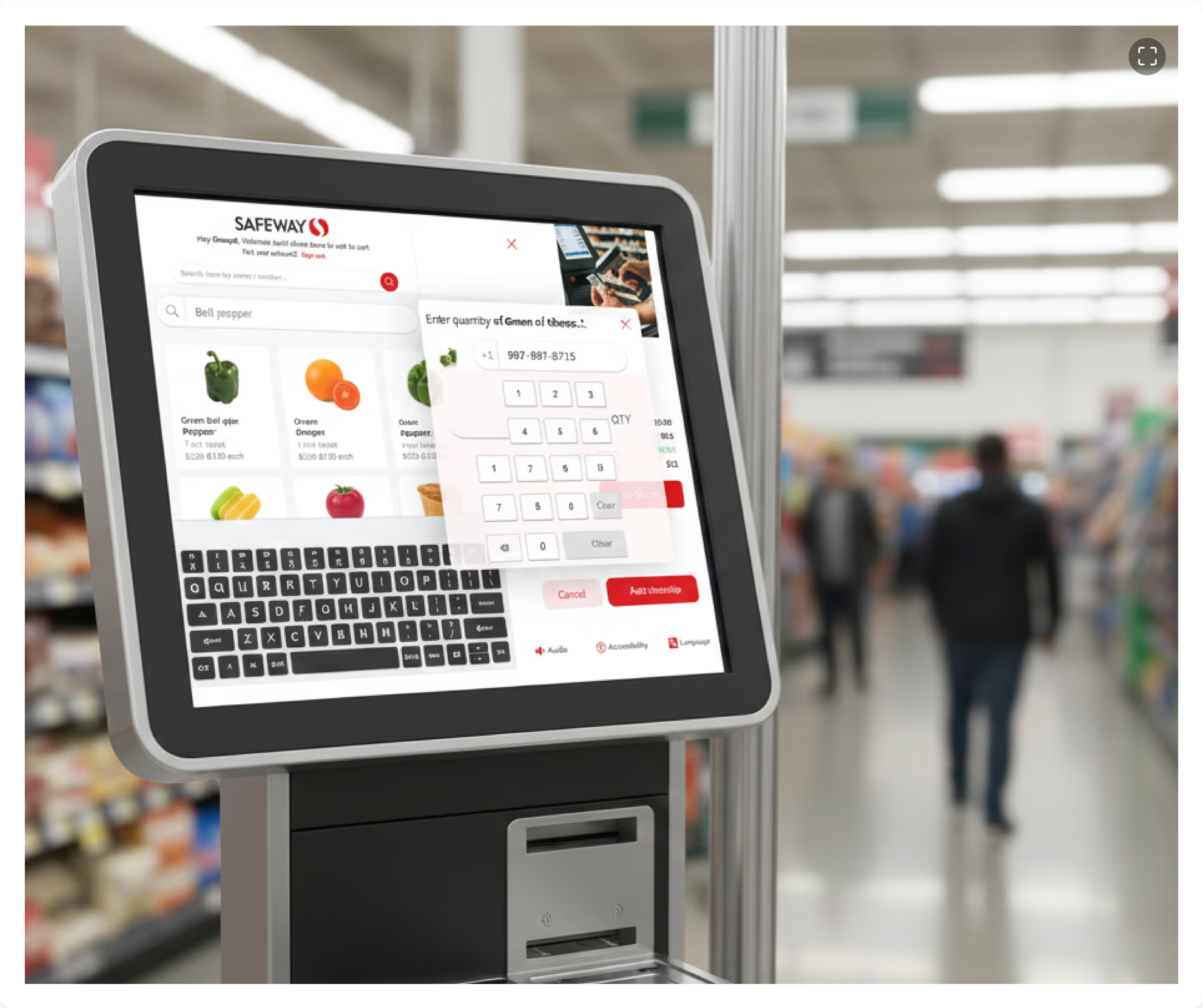
Current home screen — three search options creating visual clutter
Search requires exact product names
Discounted vs. voided items — hard to tell apart
We ran moderated usability tests with three user types, observing task duration, hesitations, facial expressions, and screen-recording interactions.
Participant 1
Participant 2
@4x.png)
@4x.png)
@4x.png)
User Personas — frequent shopper, occasional visitor, first-time user
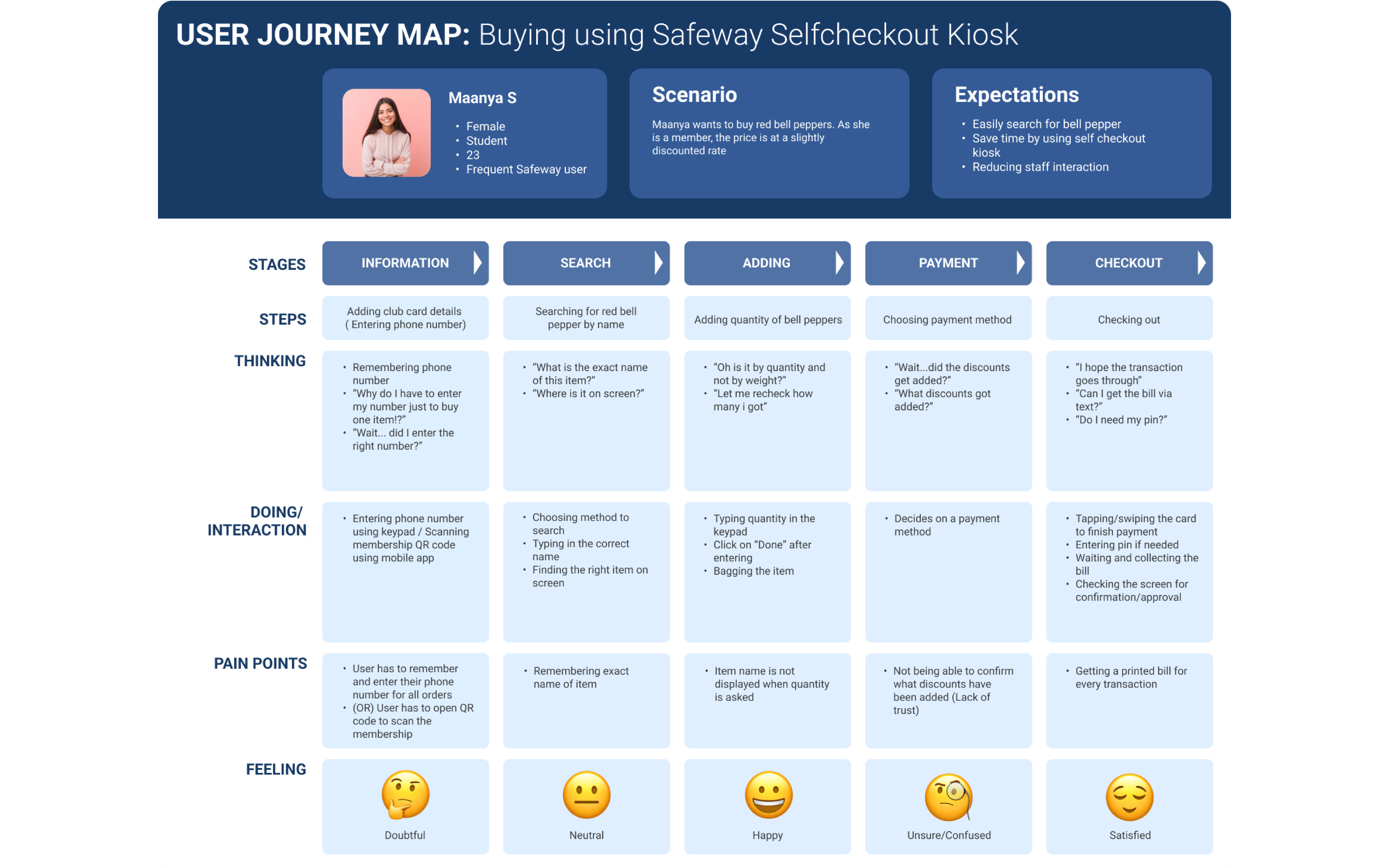
End-to-end user journey map
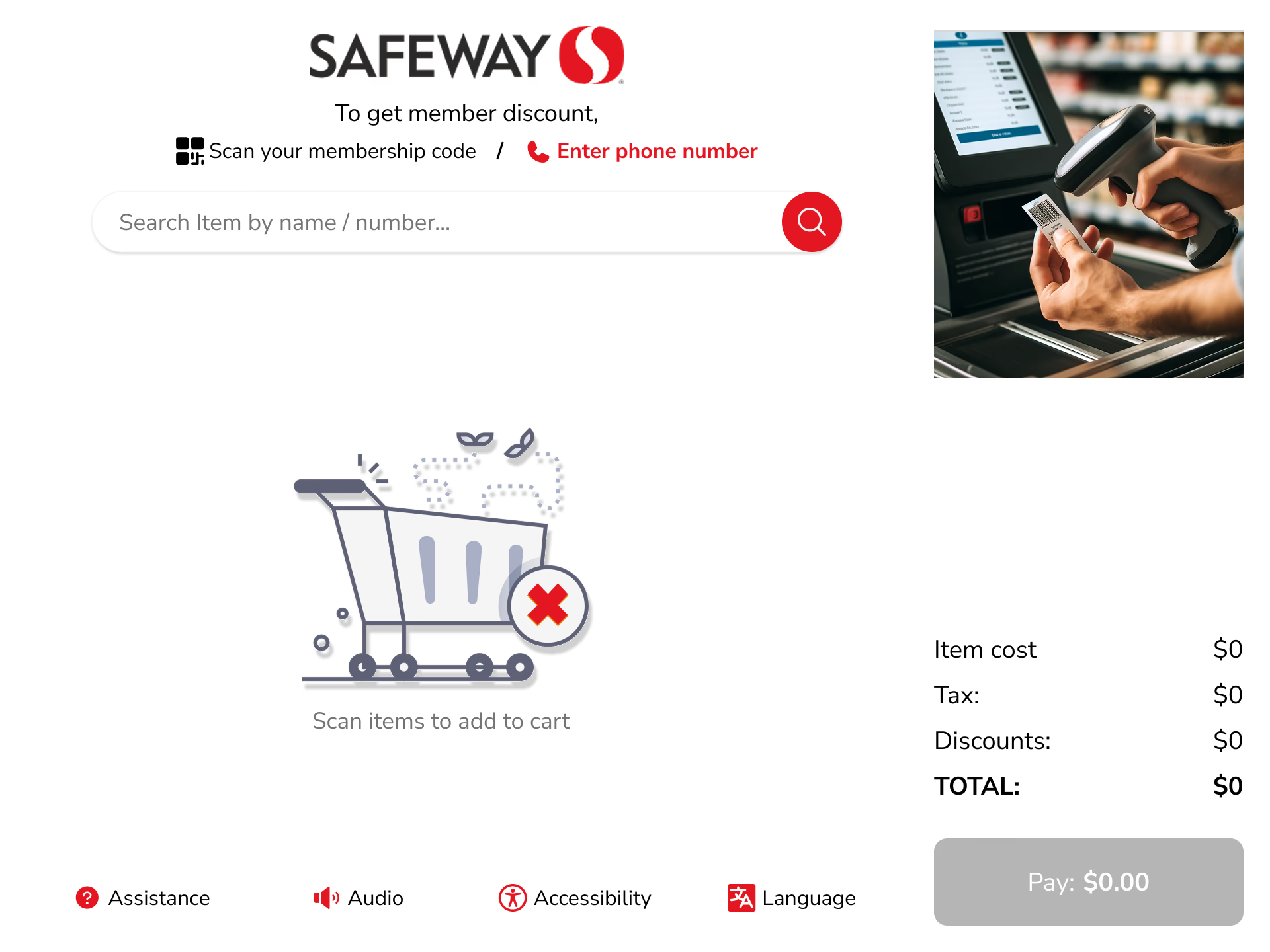
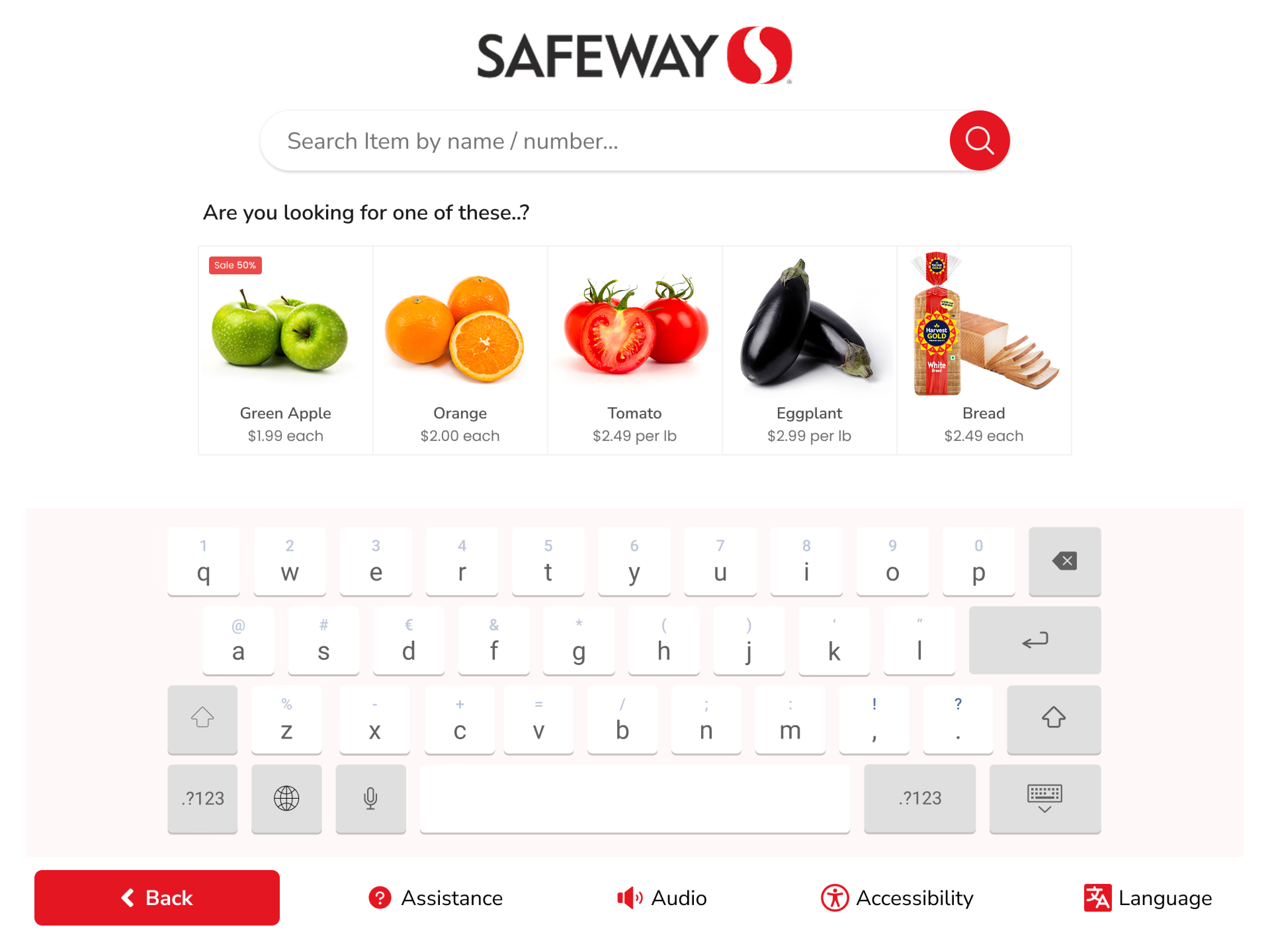
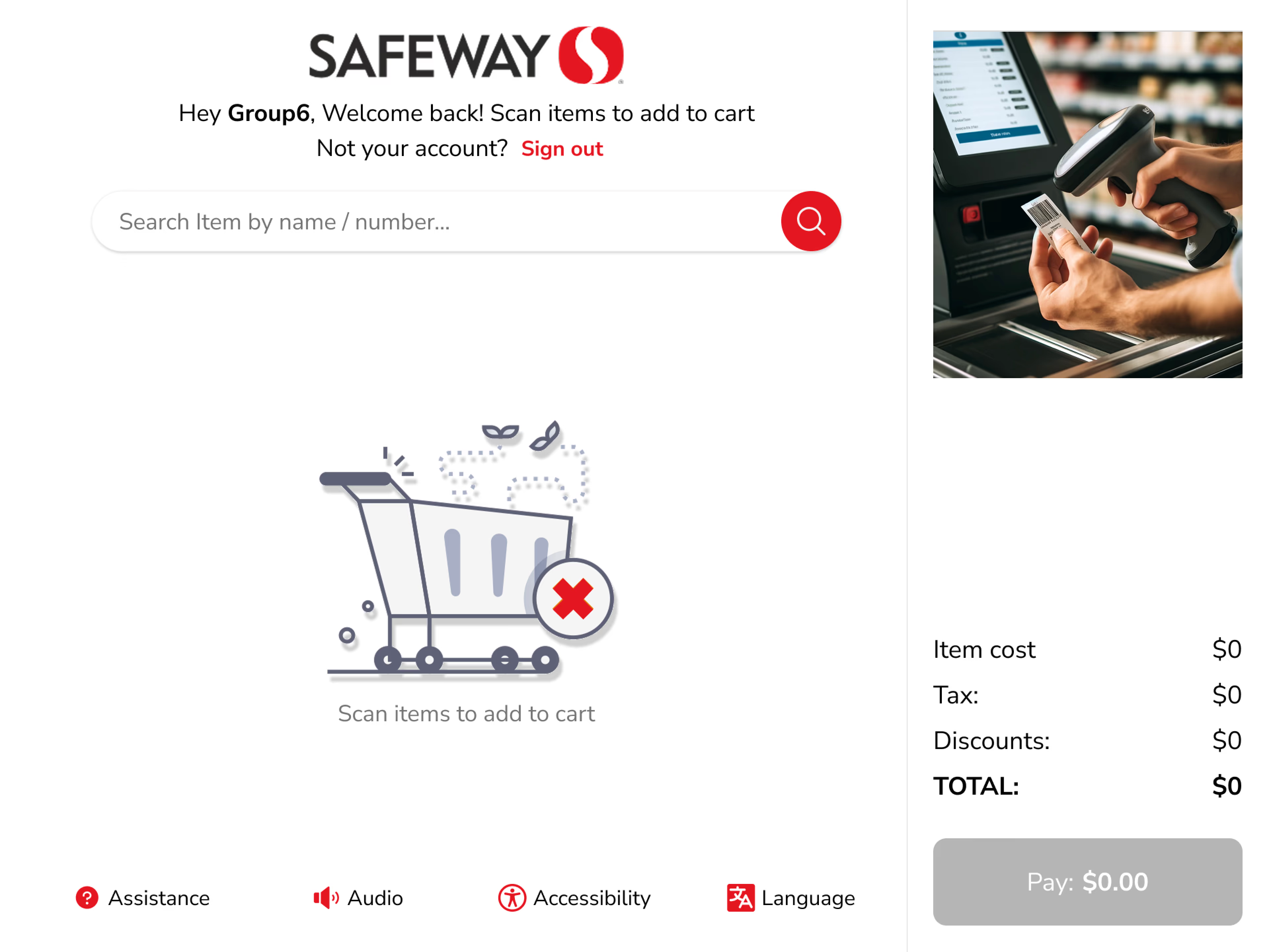
A subtle side animation helps users understand how to scan items, while the familiar search bar offers an alternative for those without barcodes. Search results offer related items and extra details to guide selection with ease.
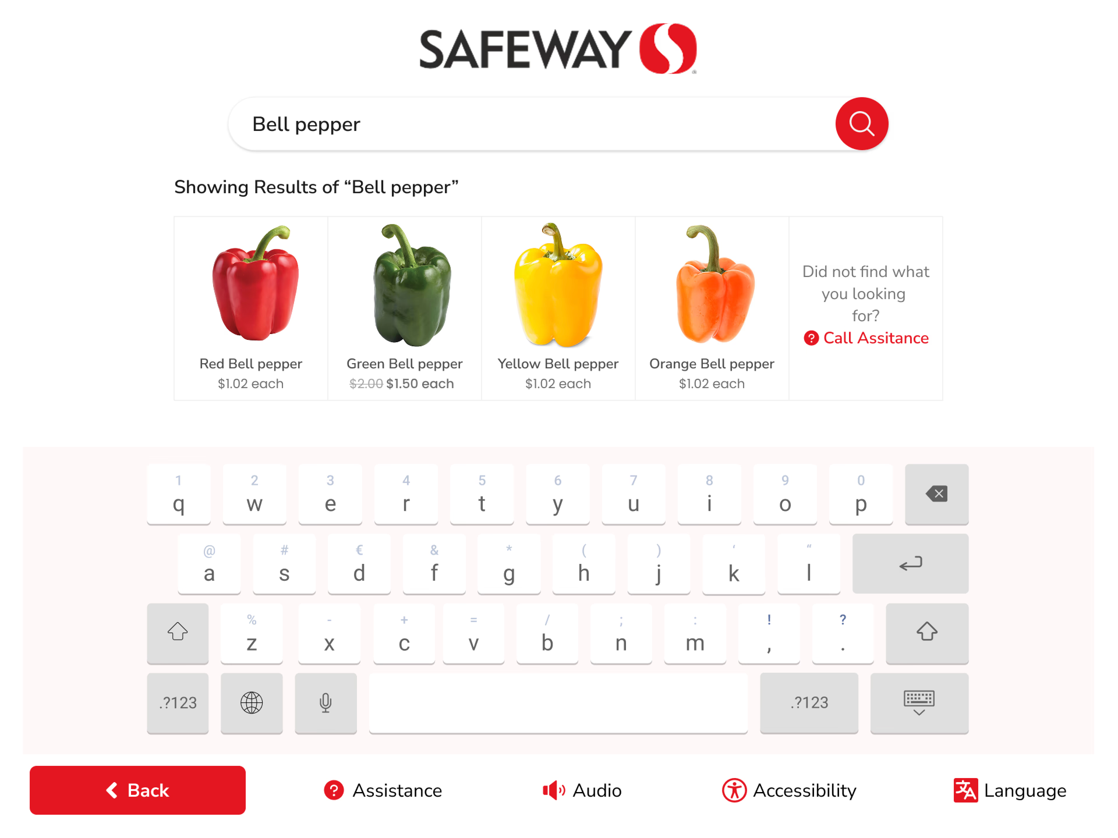
Smart search — related items and visual cues
New users found the audio message about adding a club card unclear and confusing. We redesigned the membership prompt with clearer language, visual confirmation, and a distinct state change when details are added.
Membership entry — clear prompt
Membership confirmed — visual feedback
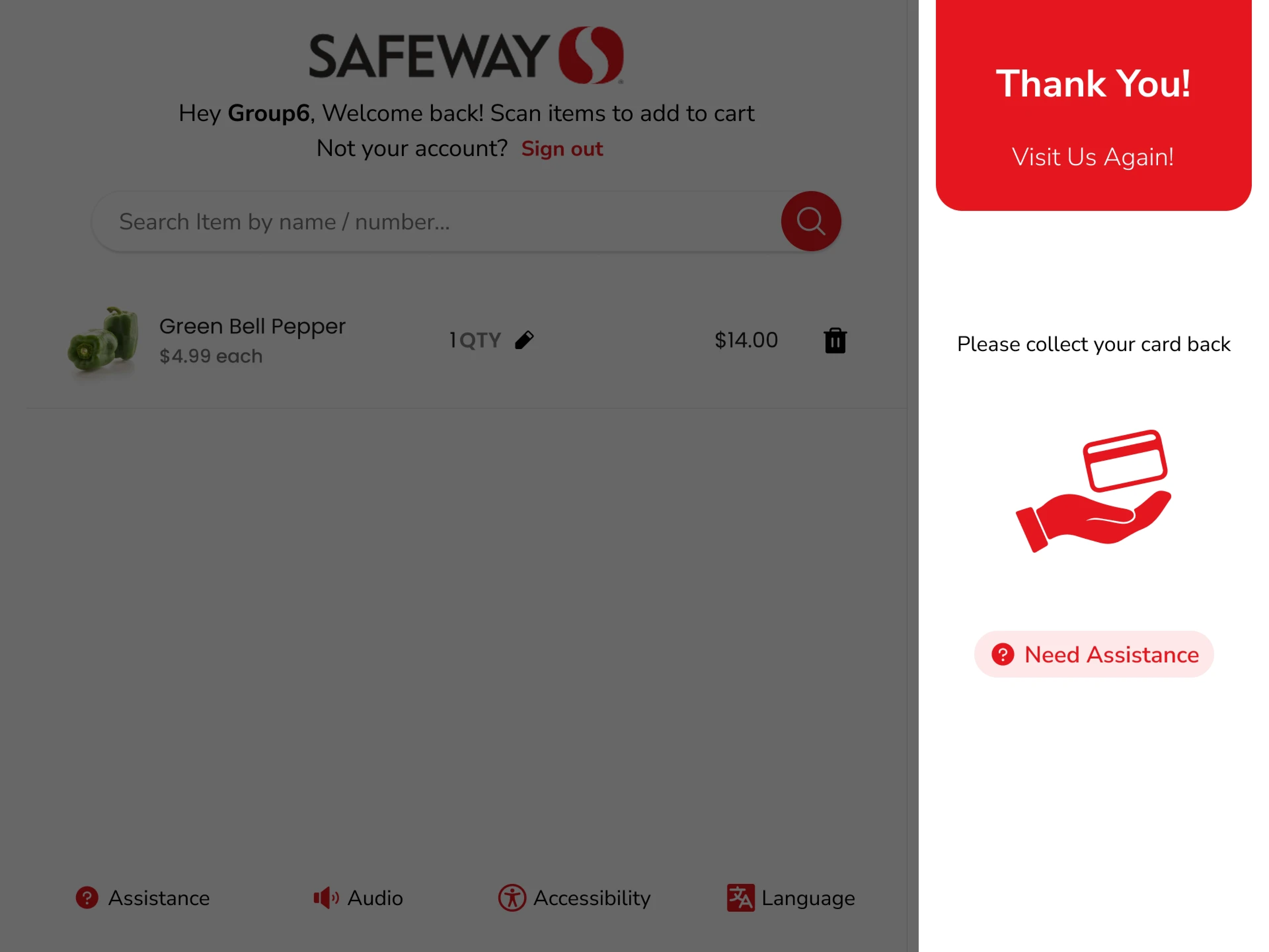
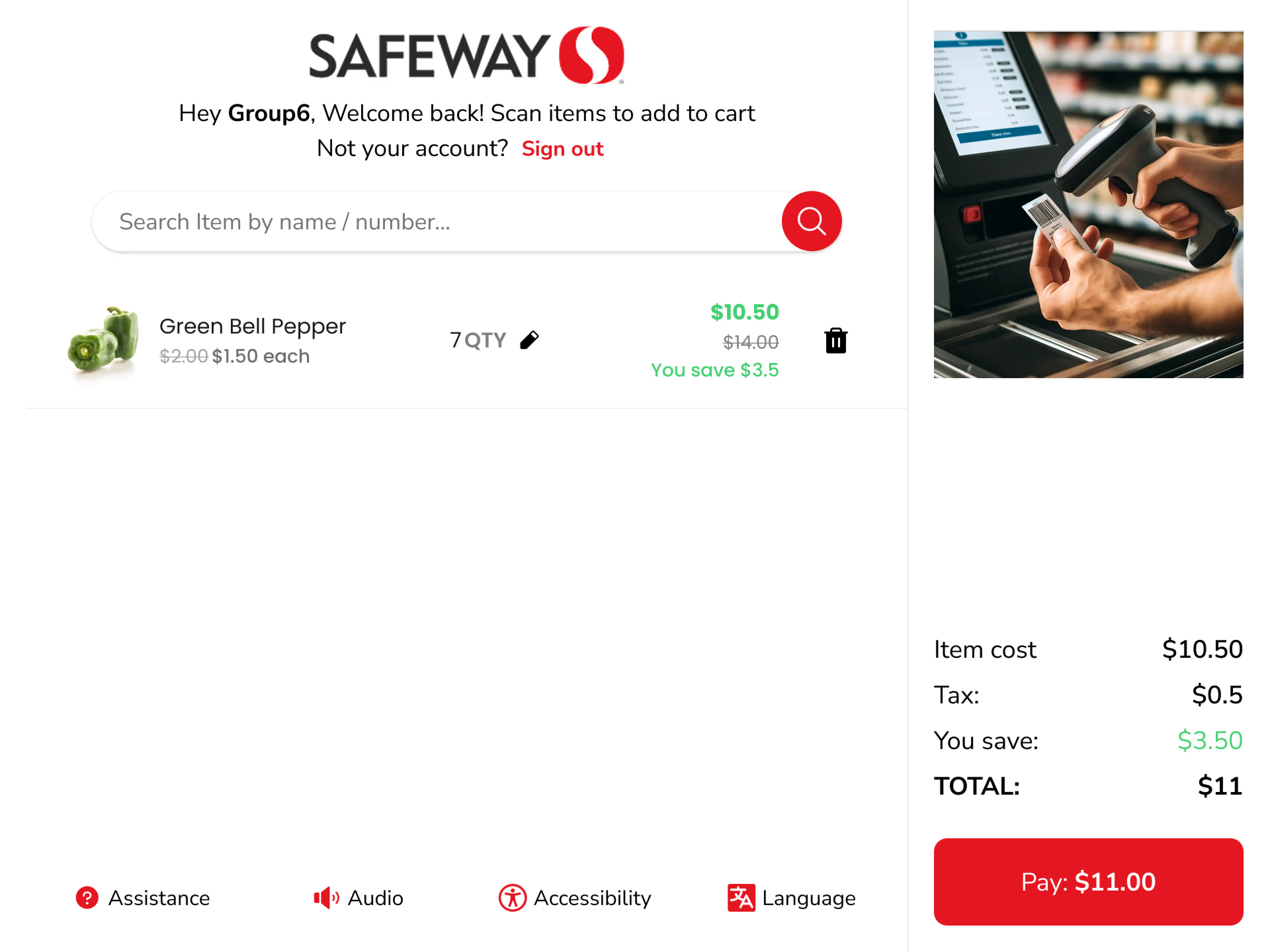
Discounts are now displayed directly on the kiosk during checkout with distinct visual styling for savings — making them easy to differentiate from other offers and helping users feel confident about what they're saving.
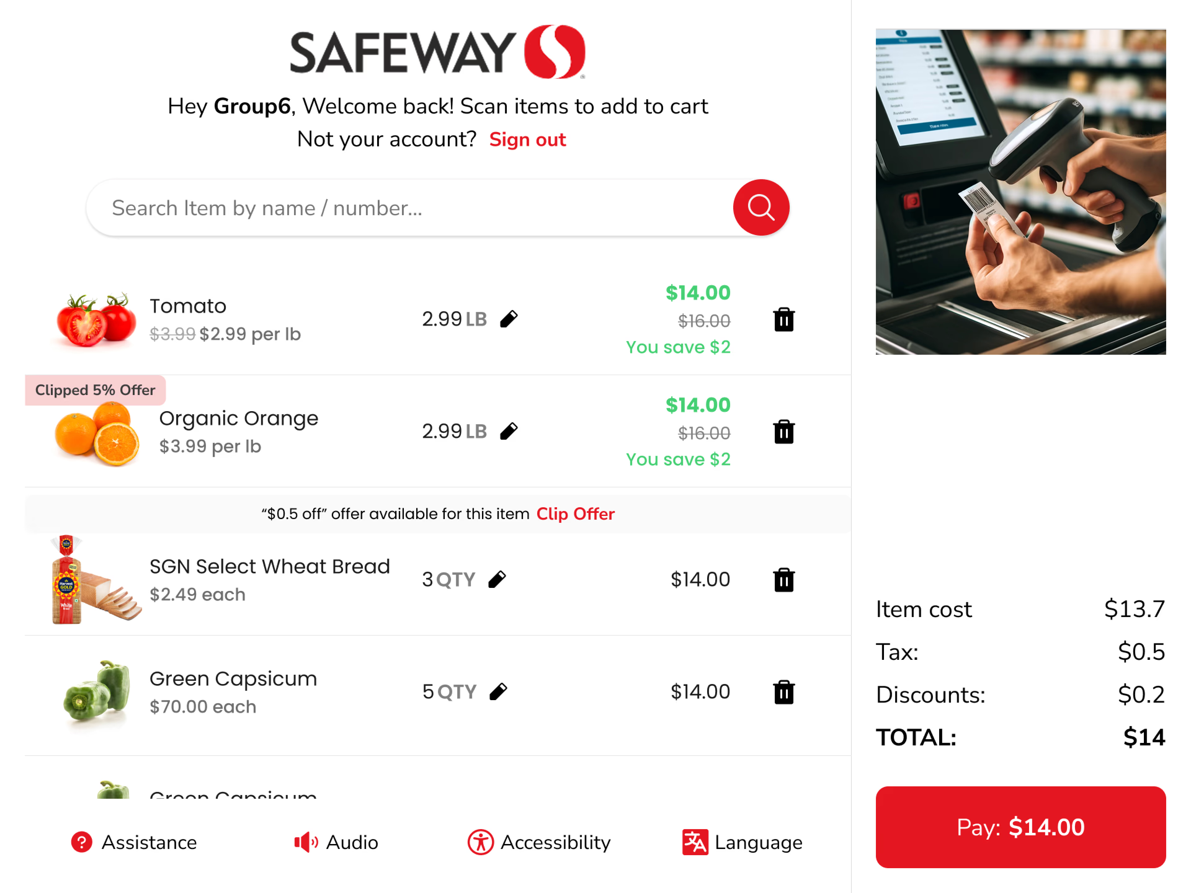
Discounts now clearly visible during checkout
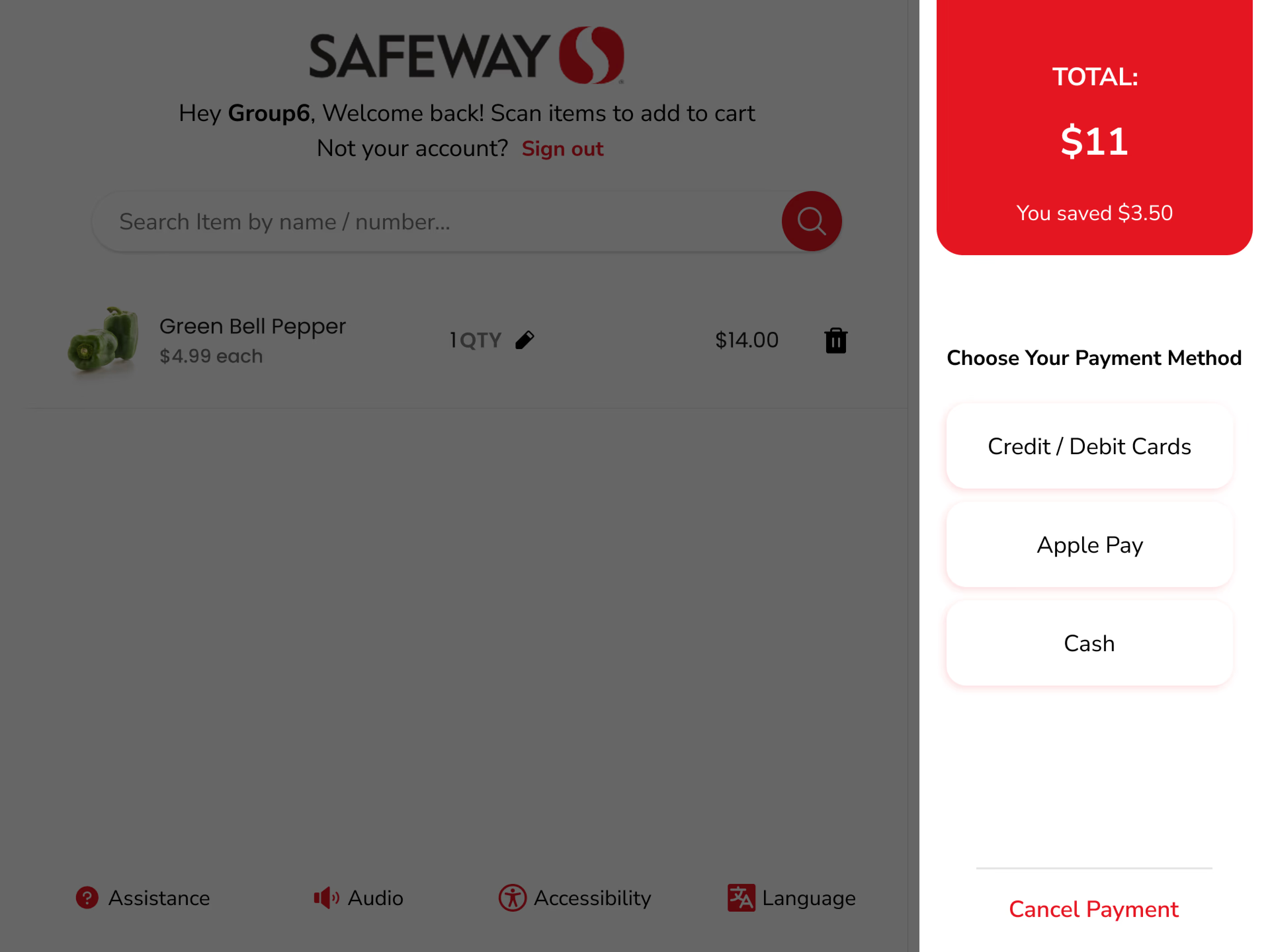
Payment method selection
Payment confirmation
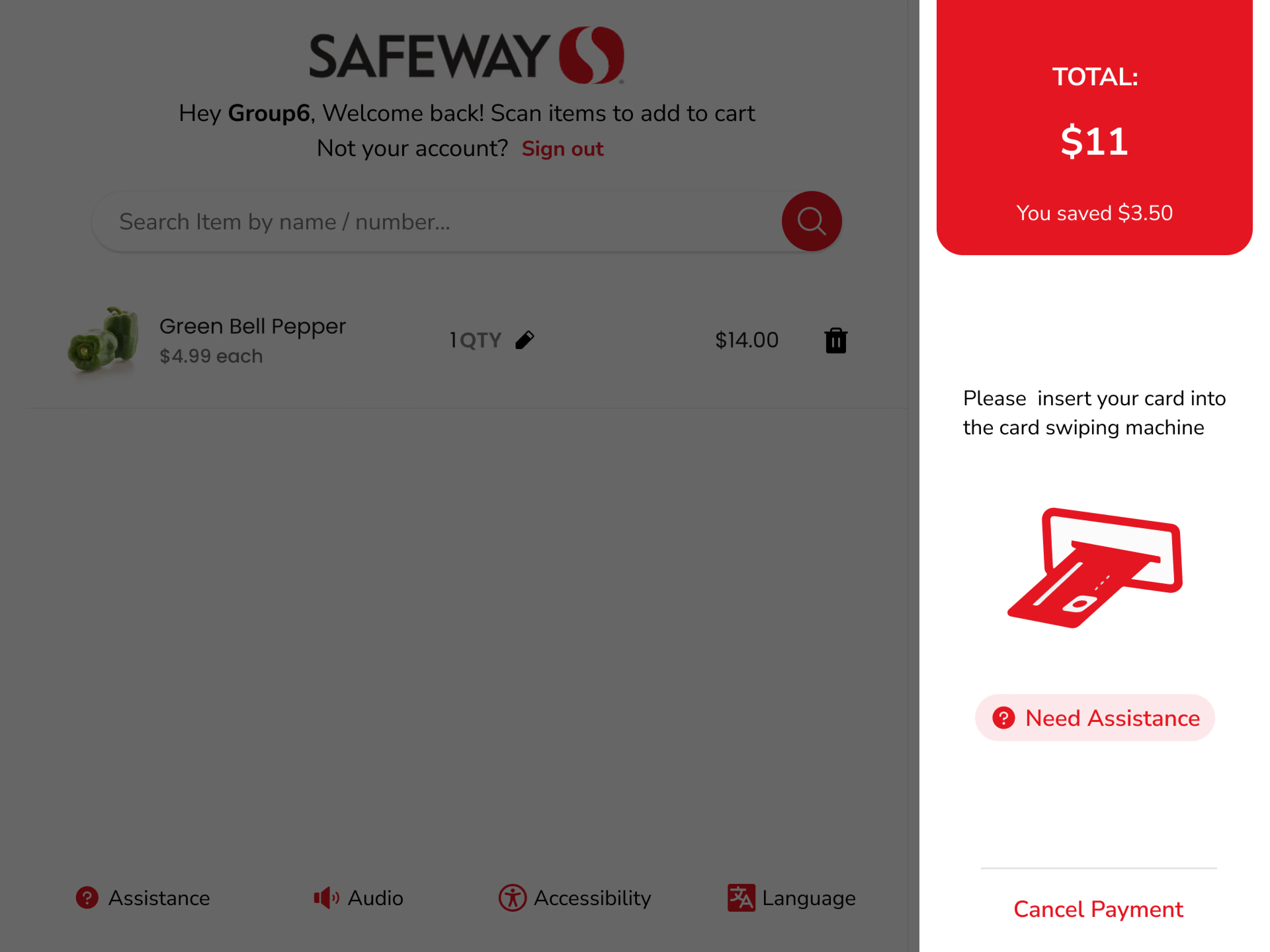
Insert card prompt
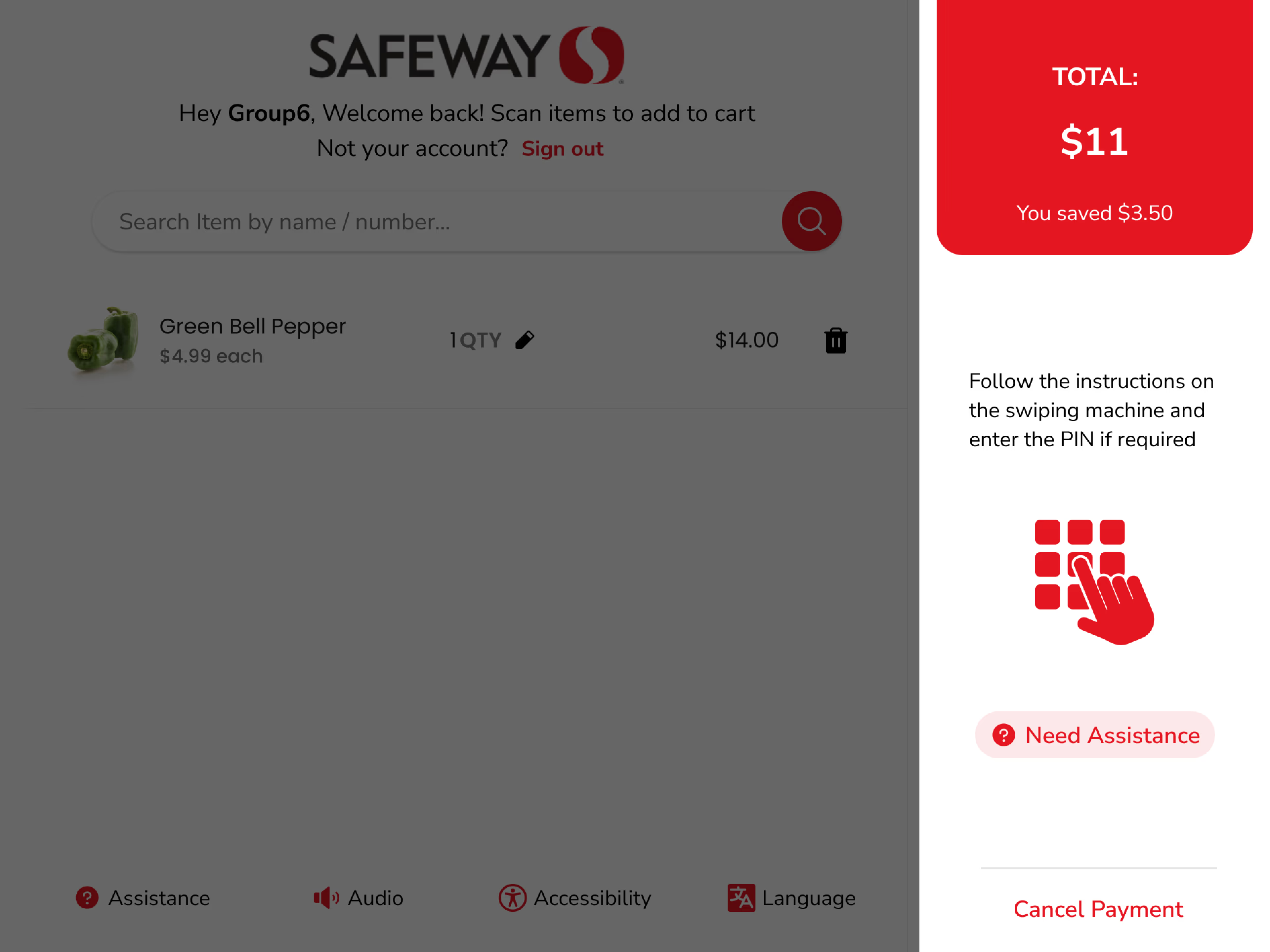
PIN entry
Usability testing with three user types showed about a 40% faster checkout time. Although the environment differed from actual Safeway checkout areas, users adapted quickly to the new UI, flow, and interactions, reducing confusion and errors.
"With our new visual branding and language in place, the new Safeway brand clearly captures the essence of Safeway's current and target customer base, our employees, and our values."
— Heather Lum, Methods & Tools Human System Engineering, Professor, Arizona State UniversityThe Safeway Kiosk brief was academically framed but operationally real — the goal wasn't a polished concept deck, it was a usable self-checkout interface that would hold up under real shopper stress. The constraint wasn't inspiration; it was time. A semester sprint meant I had to ship a testable, working prototype or nothing at all.
With a fixed semester deadline and a target of 40% faster checkout times, quality in the critical path was non-negotiable. Loyalty card integration, personalisation features, and accessibility edge cases were consciously parked. The base checkout flow had to be bulletproof — every extra feature was a risk to the core.
"The best retail UX isn't clever. It's invisible. If the user is thinking about the interface, you've already lost."
Conclusion
The Safeway Kiosk redesign successfully addressed usability issues, resulting in a more intuitive and user-friendly experience.
The improved UX/UI design led to increased user adoption, engagement, and satisfaction — demonstrating the value of principled heuristic methodology applied to real-world retail environments.
Glad we could cross paths.
Out of anywhere you could be, you're here.