Building and scaling Nature Counter design system
Established the foundational design system for NatureCounter, empowering the app’s mission to reconnect users with nature through trackable, shareable, and goal-driven journaling.

California, USA
2020
Health, Wellness & Fitness
NFP
Associate Members
223
Challenge
NatureCounter is an early-stage well being app encouraging users to spend mindful time outdoors by logging their nature exposure. When I joined, the app had core functionality in place, but lacked UX consistency, scalable design components, and a visual language to guide future enhancements.
Over the course of this project, I helped define a reusable component system, enhance interaction flows, and design scalable UI frameworks tailored to both new users (FTUE) and returning nature explorers. This was achieved through proprietary component libraries I built in Figma, cross-platform styling rules, and collaboration with engineers to ensure pixel-perfect implementation.
Design System Foundation
Built a modular design system from the ground up with consistency and scalability at its core.
Defined a visual hierarchy for typography, iconography, and spacing across the app.
Introduced atomic principles for buttons, form elements, and feedback states (e.g., disabled “Save Journal” button, green success states).
Established consistent layouts across screens—from home dashboards to journal entries—with clear call-to-action flows.


Designing Scalable Components

Pattern Documentation and Interaction Guidelines
Standardized interaction patterns for journaling workflows and goal tracking.
Created documentation for micro-interactions (e.g., start timers, select start times, edit goals).
Set behavioral rules: “Start” button state logic, transition animations for journal submissions, etc.
Improved first-time user experience by streamlining onboarding flow (as detailed in onboarding guide).

Cross-functional Handoff and Visual QA
Aligned designs closely with development for smoother implementation and iteration.
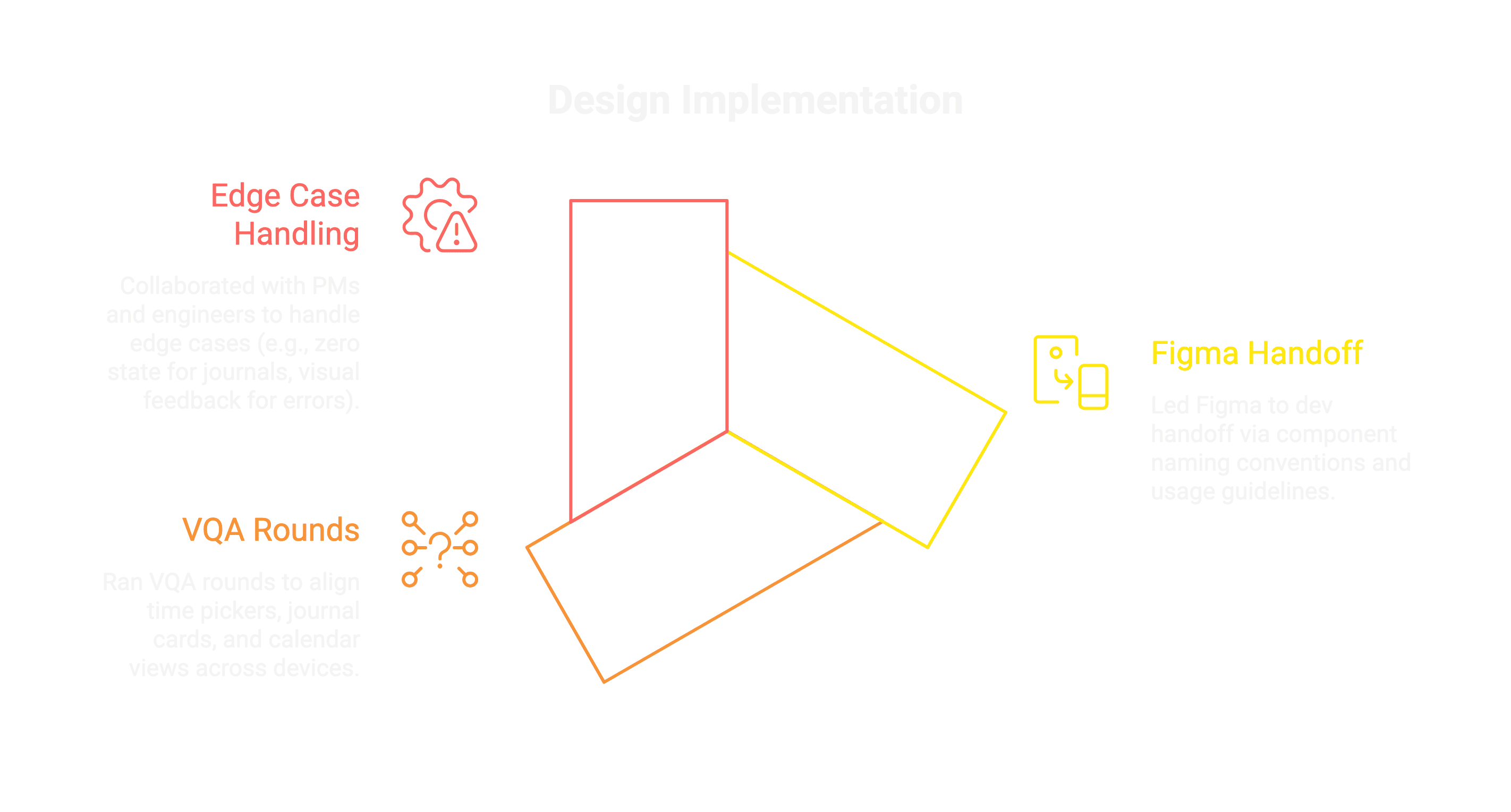
Led Figma to dev handoff via component naming conventions and usage guidelines.
Ran VQA rounds to align time pickers, journal cards, and calendar views across devices.
Collaborated with PMs and engineers to handle edge cases (e.g., zero state for journals, visual feedback for errors).
Conclusion
Designing NatureCounter's system reminded me how impactful small, consistent experiences can be—especially when they inspire real-world behavioral change. A robust design system not only enhanced app reliability, but made it easier to iterate, scale, and adapt the product with confidence.
Outcome
30%
reduction in UI inconsistencies
25%
Faster feature rollout
84%
Improved onboarding completion

This was just a glimpse into my work crafting NatureCounter’s design foundation. Curious to dive deeper into my process, usability tests, or pattern libraries? I’d love to chat!