DreamCollege AI

Project: DreamCollege AI: Building Trust in AI-Powered College Counseling

Description: AI-powered SaaS platform for college admissions counseling


Org: DreamCollege

Team: Cross-functional collaboration with 4 developers, 4 UX designers, CEO, CFO, and key stakeholders

Timeline: 4 months

Role: Lead Designer (0-1)

(Research → IA → UX → UI → Prototyping → Testing)

Starting with a thank you

I appreciate you taking the time to review this case study. I chose this example because I feel it demonstrates:

  • Shipped fast on a 0→1, high-visibility product.

  • Identified and optimized a key friction issue—a 47% drop-off before payment by prioritizing trust.

  • Influenced cross-functional roadmap decisions using user research and funnel data.

  • Designed within real technical constraints.

Headquarters

Frisco Texas

Founded

2023

Industry

SaaS

Skills

UX Research
Systems Thinking
Prototyping
Information Architecture
Usability Testing
Localisation

Company size

11-50

The Challenge

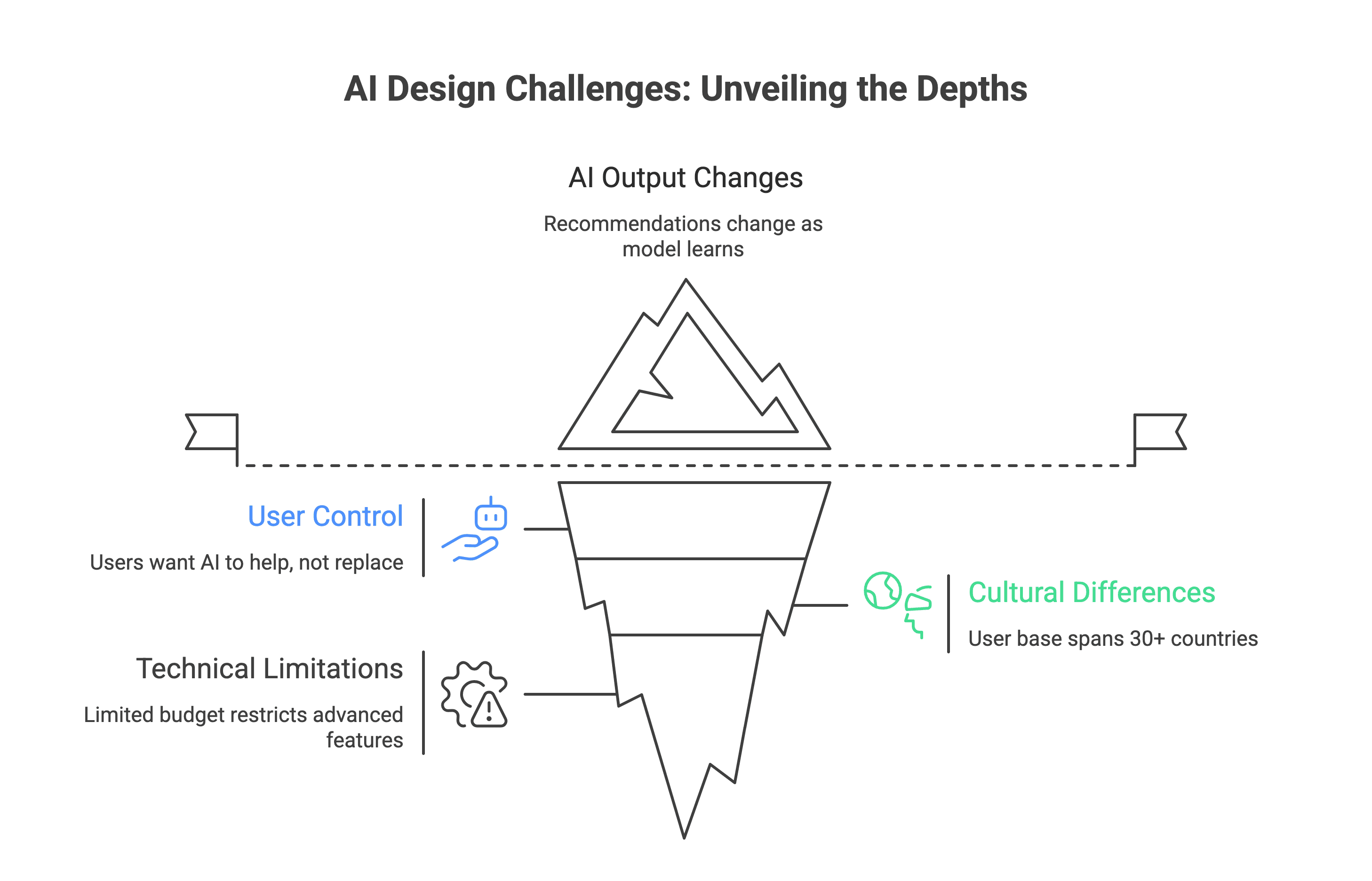
The Problem Space: When I joined DreamCollege AI at the ideation phase, the college admissions landscape was facing a critical trust deficit. Students and families were making life-changing decisions worth hundreds of thousands of dollars, yet they were hesitant to trust AI with guidance that could shape their futures.

Core Challenge: How might we design an AI-powered college counseling platform that feels as trustworthy, personal, and reliable as working with a human counselor while serving users at scale?

Solution

How might we design an AI-powered college counseling platform that feels as trustworthy, personal, and reliable as working with a human counselor while serving users at scale?

Why This Mattered ?

High stakes: College decisions represent $591.1 billion in 2025 in the US

  • Trust barrier: 73% of prospective users expressed skepticism about AI making recommendations for major life decisions

  • Market gap: Traditional counselors serve 1-2 dozen students; we needed to serve thousands while maintaining quality

  • Timing pressure: Limited 4-month runway to launch with constrained budget and talent pool

My Role & Impact

What I Did

Led end-to-end design from 0→1, translating ambiguous AI and Data heavy business and user requirements into clear, user-centered experiences across:

  • Conversational AI interfaces (chatbot, AI tutor)

  • Multi-step onboarding and profile building (Hub and spoke)

  • Payment flows and subscription management

  • Core product features (college matching, essay writing, activity exploration)

Established design foundation:

  • Defining the product's visual language and design system

  • Creating design tokens and naming conventions for seamless design-to-dev handoff

  • Building scalable component libraries that reduced design-to-development time

  • Art directing all user-facing touchpoints to ensure consistency and emotional trust

Drove research:

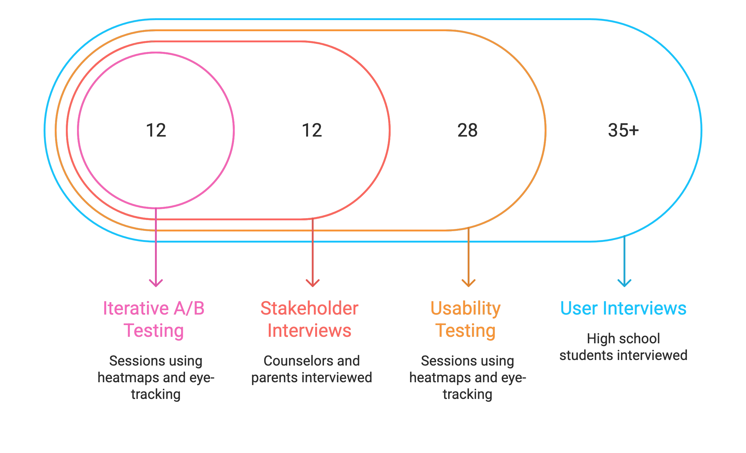
  • 35+ user interviews with high school students (grades 9-12)

  • 28 usability testing sessions using Hotjar heatmaps and Tobii eye-tracking

  • 12 stakeholder interviews with counselors and parents

  • Iterative A/B testing on critical conversion points

Key Problems

The Results

User Growth:

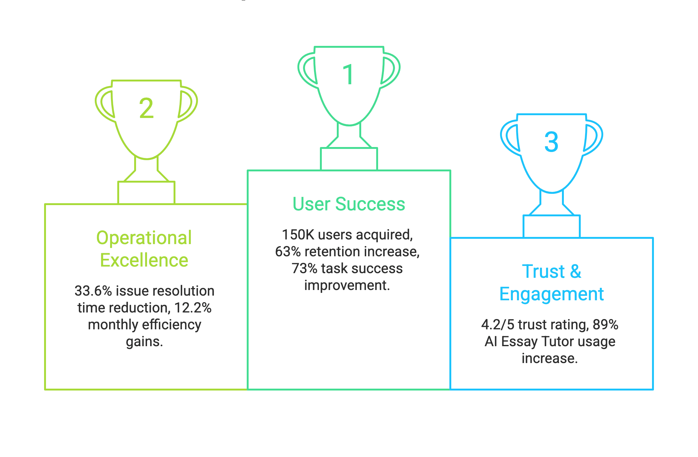
  • Scaled from 0 to 150K+ users in 4 months

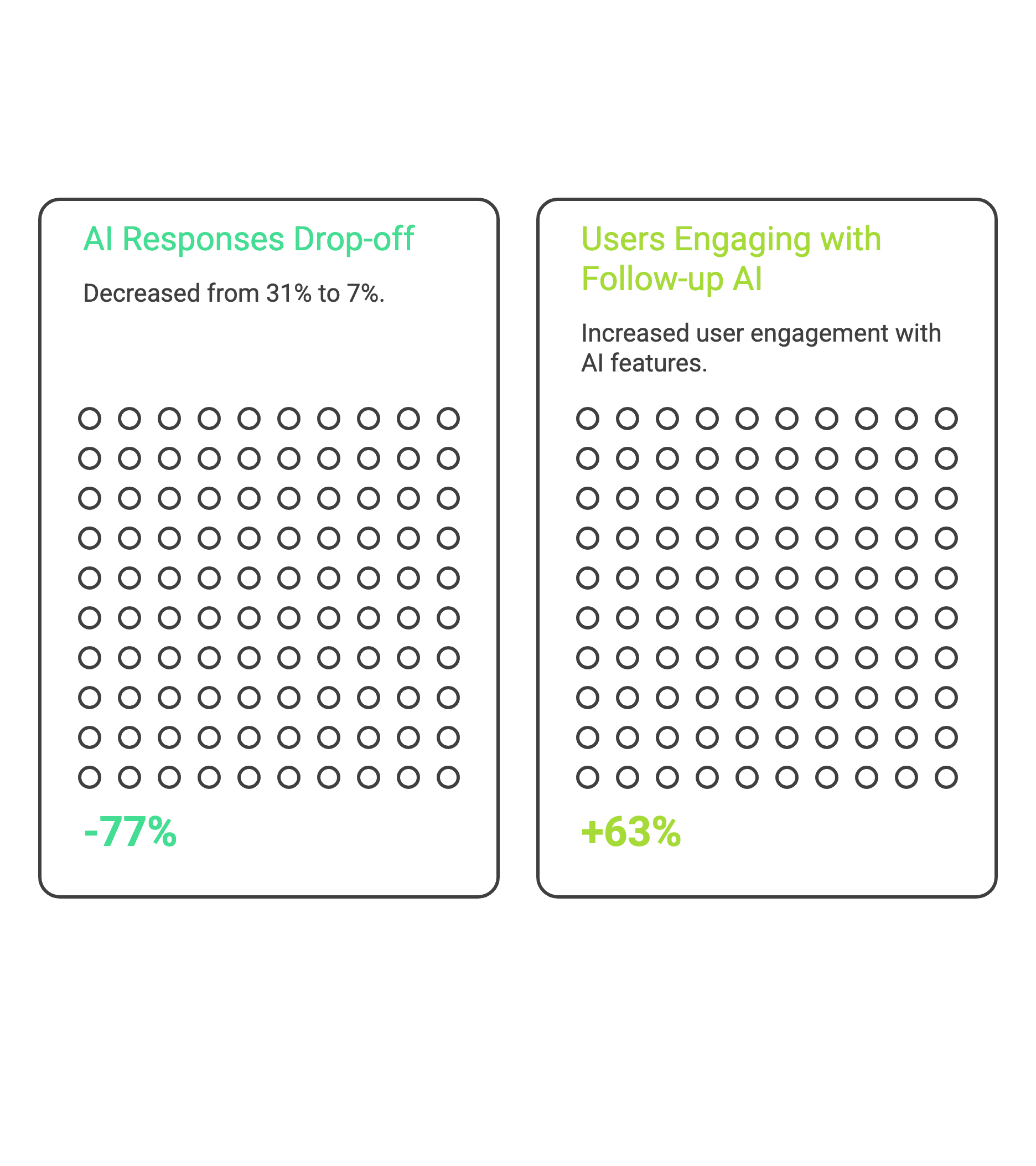
  • 63% increase in user retention through conversational AI improvements

Operational Efficiency:

  • Reduced issue resolution time by 33.6% in month one, then 12.2% month-over-month

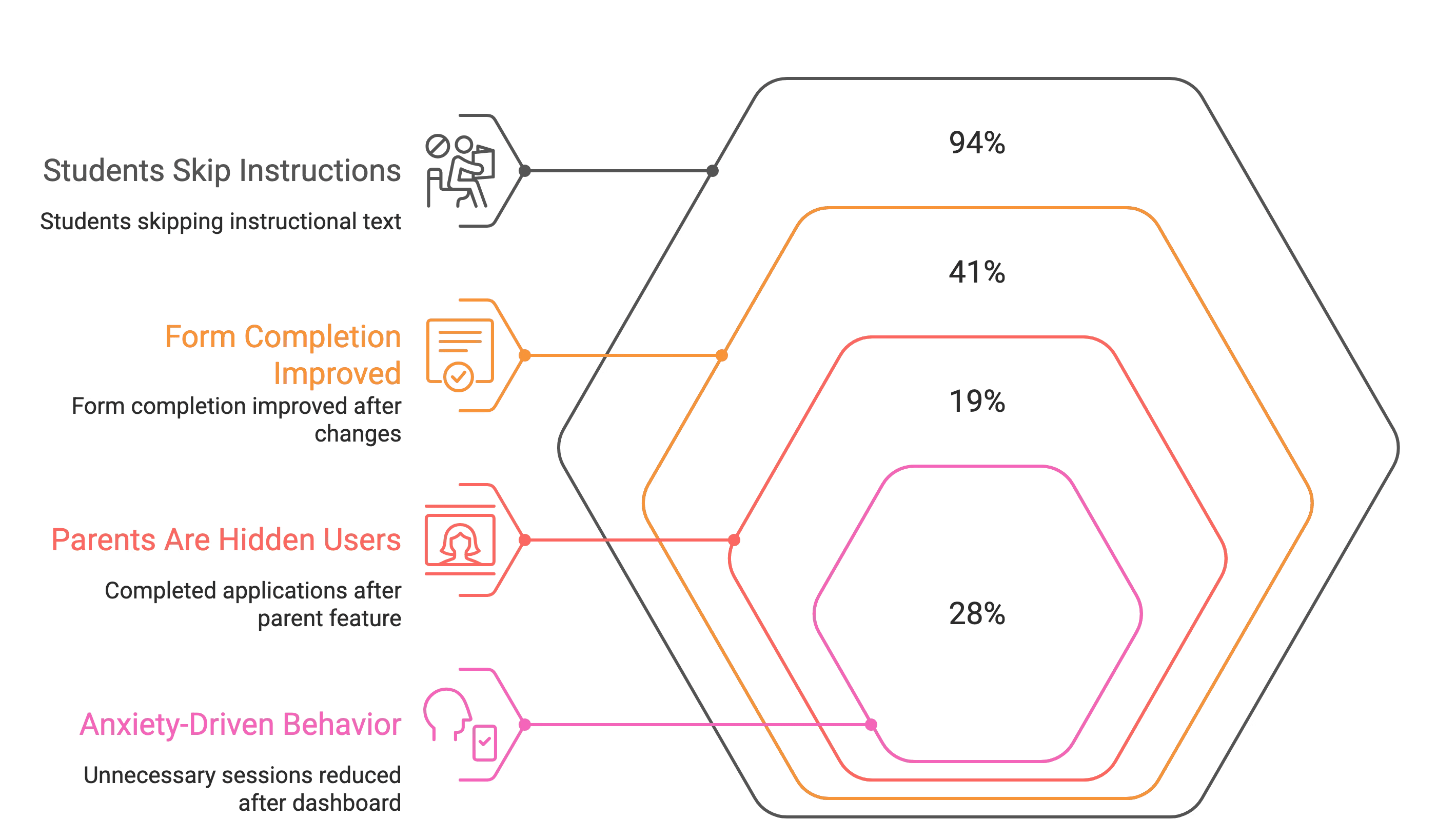
  • Improved task success rate by 73% through simplified workflows and clear visual affordances

Engagement Metrics:

  • Boosted average session duration by 40% through responsive, trust-building interactions

  • Decreased task completion time by 52% (from 41% time-on-task to 19%) via streamlined information architecture

Team Efficiency:

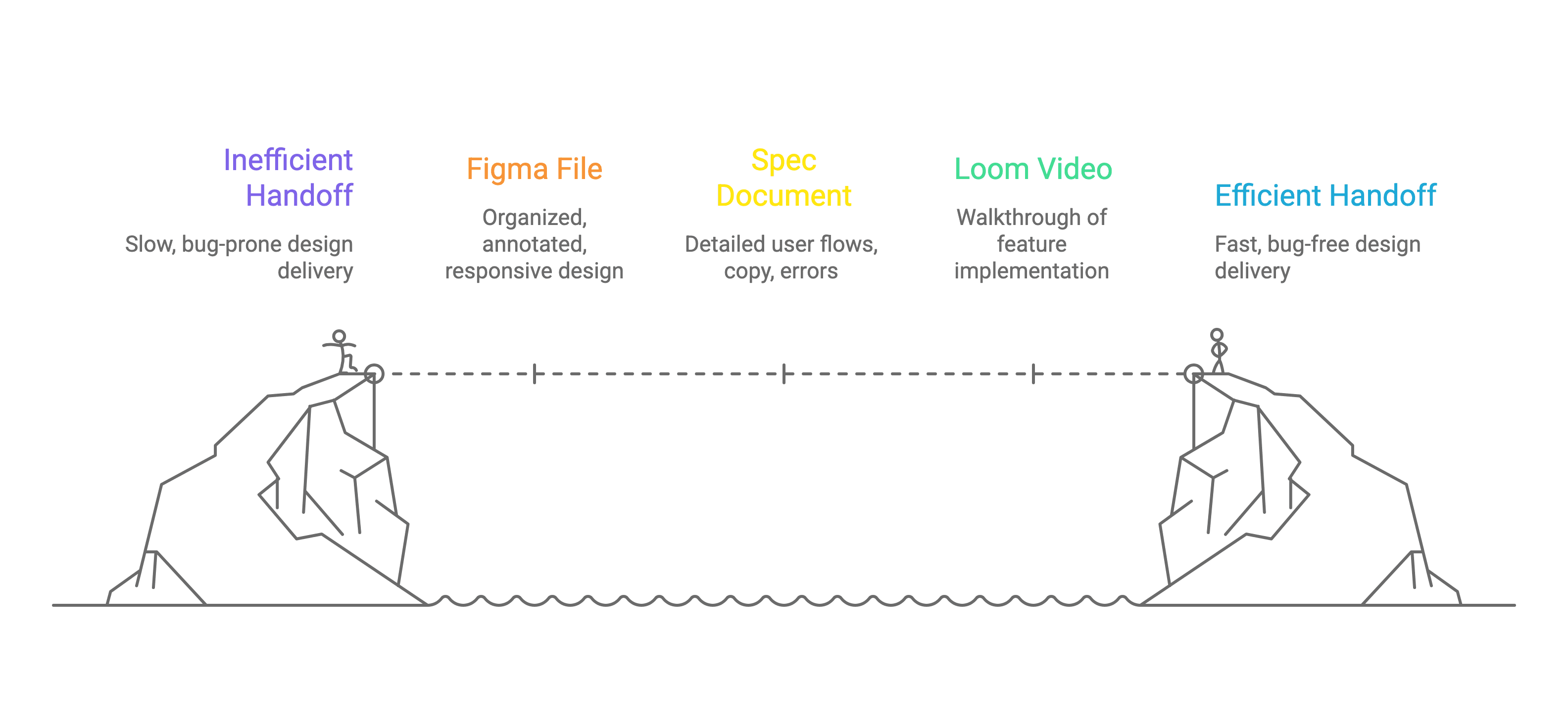
  • Cut design-to-development handoff time by 45% through systematic design tokens and documentation

The Process

Research Methods:

Primarily we conducted competitive analysis of 8 college counseling platforms (Common App, Naviance, CollegeVine, traditional counseling services)

  • Journey mapping across 6 user personas (varying by grade level, academic achievement, socioeconomic background)

  • Heuristic evaluation of existing AI chatbots in education (Khan Academy, Duolingo, Quizlet)

1. Discovery & Research (Week 1-2)

Understanding the Trust Problem

I began by immersing myself in the problem space. Through interviews with 35+ students and 12 parents/counselors, I identified three critical trust barriers:

Key Insight 1: "Black Box" Anxiety
Users felt uncomfortable when they couldn't see "what the AI was thinking." One student said: "It's like asking for directions from someone wearing a blindfold—even if they're right, I can't trust it."

Key Insight 2: The Comparison Trap
Students weren't comparing us to other AI tools—they were comparing us to their mental model of a "good counselor": someone who knows them deeply, explains their reasoning, and adapts to their unique situation.

Key Insight 3: Emotional Stakes ≠ Logical Stakes
Even when users logically understood AI capabilities, their emotional response was skepticism. This wasn't about features—it was about feeling safe with a high-stakes decision.

2. Problem Framing & Strategy (Week 2-3)

Defining Design Principles

Based on research insights, I established three north-star principles:

  1. Transparent by Default: Show users what's happening behind the scenes at every step (Visual Ques)

  2. Human-Centered AI: Make AI feel like an intelligent assistant, not a replacement for human judgment

  3. Progressive Trust: Earn trust incrementally through small wins before asking for big commitments

Design Goals:

  • Create intuitive flows where users always know the next step (reduce cognitive load)

  • Minimize clicks while maintaining context (efficiency without sacrificing understanding)

  • Build visual and conversational patterns that communicate reliability

Hospital Systems

Too complex. Internet dependent.

NGO Workflows

Paper-based, verbal, unpredictable.

Training

Irregular, in-person only, not digitisation -ready.

Connectivity

Unreliable, 3G at best.

Design had to bend to the ground reality, not the other way around.

3. Visual Design & Design System (Week 4-6)

Establishing Visual Trust Signals

Working closely with the CEO and branding stakeholders, I developed a visual language that balanced approachability (friendly, educational) with credibility (professional, data-driven).

Color Strategy:
I chose a gradient-heavy palette (blues → purples) that:

  • Conveyed innovation and technology (blues)

  • Differentiated us from corporate competitors (gradient execution)

Design System Components:

I built a comprehensive design system with:

  • 48 reusable components (buttons, form fields, cards, modals, navigation elements)

  • Design tokens for colors, typography, spacing, and shadows

  • Naming conventions mirroring front-end frameworks (e.g., btn-primary-lg, card-outlined-hover)

  • Documentation for states, variations, and usage guidelines

Developer Collaboration:
I held weekly design-dev syncs where we:

  • Reviewed component implementation side-by-side

  • Agreed upon on naming conventions

  • Flagged edge cases and discussed solutions together

  • Used shared Figma libraries that auto-synced with our codebase

Result: Design-to-development handoff time dropped 45%, and developers could implement 80% of designs without clarification questions.


4. Conversational AI Design (Week 5-8)

The LLM Response Challenge

One of the biggest UX challenges: keeping users engaged while the LLM generated responses (3-8 second delays). Initial testing showed:

  • 31% of users clicked away during loading

  • Users reported feeling "ignored" or unsure if the system was working

Impact:

  • Drop-off during AI responses decreased from 31% to 7%

  • Users rated AI interactions as "trustworthy" 4.2/5 (up from 2.8/5)

  • 63% increase in users engaging with follow-up AI features

5. Critical Design Decisions

Critical Design Decisions

6. Testing & Iteration (Week 7-12)

Continuous Validation

Hotjar Heatmaps: Revealed that users were clicking on non-interactive elements (icons, headings) expecting them to be buttons. I redesigned these as genuine interactive elements or removed them to reduce confusion.

Tobii Eye-Tracking (12 sessions):
Discovered that users were skipping important context text because it was styled too similarly to body copy. I introduced:

  • Icon badges for "important info"

  • Colored background callouts for critical notices

  • Larger font sizes for key decision points

A/B Testing Highlights:

Test 1: CTA Button Text

  • Original: "Save and Continue" (54% click-through)

  • Variant A: "Save My Progress" (62% click-through)

Test 2: AI Response Styling

  • Original: Plain text in chat bubbles (3.2/5 trust rating)

  • Variant A: Formatted with bullets and bold headers (3.8/5 trust rating)

    Test 3: College Card Layout

  • Original: Horizontal cards with small images (23% click-through)

  • Variant A: Vertical cards with large images (31% click-through)

7. Stakeholder Management & Influence

Navigating Competing Priorities

Challenge: CEO wanted to prioritize monetization features (payment, upgrades) while I believed we needed to nail core trust and usability first.

My Approach:
I created a "Trust-First Roadmap" presentation showing:

  • User research quotes highlighting trust concerns

  • Conversion funnel data showing 47% drop-off before payment

  • Proposed sequence: Fix core experience → Build trust → Introduce premium features

Outcome: CEO agreed to delay payment v2 by 2 weeks to focus on profile UX improvements. This decision resulted in 22% higher conversion when payment was eventually released.

Key Design Features

Challenges & Learnings

Unexpected Insights

Insight 1: Students Don't Read Instructions

What we found: Hotjar data showed 94% of users skipped instructional text, including critical guidance.

What we did: Replaced text-heavy instructions with visual examples like screenshots of completed profiles, inline placeholder text in form fields, and progressive disclosure that revealed information only when needed.

Impact: 41% improvement in form completion rates.

Insight 2: Parents Are Hidden Users

What we found: Eye-tracking sessions revealed parents were frequently present during the application process—sometimes completing profiles themselves—despite the platform targeting students.

What we did: Added a "Share with Parents" feature and rewrote copy to accommodate both audiences without alienating either group.

Impact: 19% increase in completed applications.

Insight 3: Anxiety-Driven Behavior

What we found: Students checked the platform 3-4x more than necessary, constantly verifying whether their recommendations had changed.

What we did: Created a "Your Journey" dashboard displaying last updated timestamps, upcoming deadlines, progress milestones, and a "No changes since you last checked" status.

Impact: 28% reduction in unnecessary sessions while increasing meaningful engagement.

Design System & Collaboration

Cross-Functional Workflow

Weekly Design-Dev Syncs:

  • Demo new designs with interactive Figma prototypes

  • Review implementation against specs

  • Discuss technical feasibility of upcoming features

  • Align on responsive behaviors and edge cases

Design Handoff Process:

  1. Figma file with:

    • Organized layers and naming conventions

    • Auto-layout for responsive behavior

    • Annotations for interactions and logic

    • Assets exported at 1x, 2x, 3x

  2. Spec document covering:

    • User flows and state transitions

    • Copy and microcopy

    • Error states and edge cases

    • Success metrics and analytics events

  3. Loom video walkthrough (5-8 min per feature)

Collaboration Tools:

  • Figma for design (shared libraries, branching)

  • Linear for task management

  • Slack for async communication

  • Weekly critiques with design team

Result: 45% faster handoffs, 80% reduction in clarification questions, 0 major UI bugs in production

Metrics & Impact Summary

Reflections

What I'd Do Differently

Earlier User Testing
I wish I'd conducted usability tests in Week 2 rather than Week 5. We could have caught navigation issues sooner and saved 2 weeks of iteration.

What I'm Proud Of

1. Solving the Trust Problem
We didn't just build a tool, we built a relationship. Users feel confident making life-changing decisions because the AI earns trust through transparency.

2. Design System That Scales
The system I built isn't just serving 150K users today, it's architected to handle 10x growth without major refactoring.

3. Cross-Functional Leadership
I bridged design, engineering, and business, translating user needs into technical specs and business value. This skill will define my career.

Conclusion

DreamCollege AI taught me that great design isn't about making things pretty—it's about building trust when stakes are high, simplifying complexity without losing depth, and creating systems that scale.

In 4 months, we went from a blank Figma file to a platform serving 150,000 students making one of the biggest decisions of their lives. The visual design, conversational AI, and design system I built became the foundation for that growth—but the real achievement was earning users' trust.

This project proved that with clear principles, relentless user focus, and collaborative leadership, a designer can drive not just pixels, but business impact and meaningful outcomes for real people.

Glad we could cross paths.
Out of anywhere you could be, you’re here.I hope it left you with a bit of curiosity and
inspiration.

Designed by ~Puru Bhardwaj

Glad we could cross paths.
Out of anywhere you could be, you’re here.I hope it left you with a bit of curiosity and
inspiration.

Designed by ~Puru Bhardwaj